Create a basic Date table in your data model for Time Intelligence calculations

In this blog post, I am going to show you how you can quickly add a very basic Date table to your model. You might be wondering – why do you need a Date table? A Date table is very important to be able to use Time Intelligence DAX functions such as year to date, month to date, quarter to date, same period last year, parallel period, and many other similar calculations that are based on the time/period. There are approximately 35 built-in time intelligence DAX functions and we can leverage them by adding a Date table to our model.

The basic feature of the Date table is that you need continuous dates in your table. There is only unique date value, and on top of it you can add other columns, like Year, Month, Weekday, etc. based on your requirements of how you want to slice and dice the data. Some people may have a requirement to slice the data by Week Number (of the year) and others might not need this column as they would never use it.

From my experience, I have found that the following are key columns to include in your Date table. These are used quite frequently:

  • Date (this is the basic feature in the Date table, both the continuous date and unique values)
  • Year
  • Quarter
  • Month Name
  • Month Number
  • Month Year

So, what should the start and end date be in the Date table? Usually, you want to create a Date table from the start of the year (January 1st) , based on first date in your fact table. For example, if your first sale is on February 15, 2019 in your fact table then your Date table should start from January 1, 2019. The last date should be at least December 31 of the current year and if you have future date transactions in your model then the last date should be based on last date in your transaction table. Let’s assume that you have a transaction table which has future date transactions – let’s say some in 2021 and some in 2022. In this case, our last date for our Date table will be December 31, 2022. There is no problem with having dates in the future.

Let’s look at some examples of what the date range would be in the Date table at the time of writing this post (May 20th, 2020):

Earliest date in transaction tableLast date in transaction tableDate ranges for Date table
February 15, 2018January 5, 2019January 1, 2018 – December 31, 2020
June 20, 2019May 31, 2021January 1, 2019 – December 31, 2021
January 13, 2020December 31, 2023January 1, 2020 – December 31, 2023

Now, how do we create a Date table? We have two DAX functions available to create this table: CALENDAR and CALENDARAUTO. The main difference between these two function is that you pass the date range to the CALENDAR function whereas the CALENDARAUTO function looks at your data model and creates a date range based on the minimum and maximum date available in the model. The latter is exactly what we’re looking for.

Assume that I have a Sales table in my model and that the first sales date is on April 3rd, 2017. There is also a future sales date on November 30, 2022. We will use the CALENDARAUTO function to create a Date table and add other basic columns like Year, Month, Quarter etc.

Click the Calculated Table icon in the Modelling tab to add the DAX expression to create a Date table.

Create Calculated Table with DAX expression

Simply copy the below code to create the Date table in your model

Date =
//start date in my case I'm setting to 2010
//you can get date from your transaction table and start from that year, something like this
//in __startDate replace DATE (2010, 1, 1 ) 
//with -> DATE ( YEAR ( MIN ( YourTransactionTable[DateColumn] ) ), 1, 1 )
VAR __startDate = DATE ( 2010, 1, 1 ) 
VAR __endDate = DATE ( YEAR ( TODAY() ), 12, 31 ) 
VAR __dates = CALENDAR ( __startDate, __endDate )
RETURN
ADDCOLUMNS (
    __dates,
    "Year",             YEAR ( [Date] ),
    "Month Number",     MONTH ( [Date] ),
    "Month Name",       FORMAT ( [Date], "MMMM" ), --use MMMM for full month name, January instead of Jan
    "Month",            FORMAT( [Date], "MMM, YYYY" ), --use MMMMM for full month name, January instead of Ja
    "Month Sort",       FORMAT( [Date], "YYYY-MM" ),
    "Quarter",          "Q" & FORMAT( [Date], "Q, YYYY" ),
    "Quarter Sort",     FORMAT ( [Date], "YYYY-Q" )
)

With the above DAX expression, we get a Date table with the following columns:

Date Table

Now let’s check the date range we have in our Date table against what we have in our Sales table. I created MIN and MAX measures on the Date columns from both tables and depicted the results in the visual below. We can clearly see that our Date table has a date range from January 1, 2017 to December 31, 2022 and that the first date of sale is April 3, 2017 and the last date of sale is November 30th, 2022. The date range in our Date table clearly aligns with this.

Dates from Sales and Date Table

Another good feature of using the CALENDARAUTO function is that we don’t need to worry about changing the date range. As new data comes in when we refresh our Sales table, the date range for the Date table will automatically grow based on the dates in the Sales table.

One important aspect after we create the Date table is to mark this as a “Date Table.” I don’t want to go into too much detail about this, but you can read all about it here. Once we have marked our Date table, we are going to set the sorting of our columns so that when we visualize our data, our values show up correctly. For example, if we don’t sort our Month Name column then everywhere we use Month Name it will be sorted alphabetically. This means that April will shows up as the first month instead of January. I also want to hide any unwanted columns – in this case I’m going to hide the Month Sort and Quarter Sort columns because they are only used for sorting purposes but are never going to be directly used in the visualization.

You can read more about sort by column here.

The following table lists all the columns that we are going to sort and what columns we are going to sort them by.

Column NameSort by Column Name
Month NameMonth Number
MonthMonth Sort
QuarterQuarter Sort

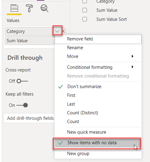
Something else I always do is change the aggregation method of any number columns to “Don’t Aggregate.” In our case, Year and Month Number are showing as aggregated columns and we know that we will never have a Sum of the Year column or the Month Number column.

Before and After Don’t Summarize

One last thing – make sure you create a relationship between the Date column from your other tables to the Date table. In this case, the Date column from the Sales table to the Date column from the Date table. Now you can use the new Date table for all your Time Intelligence measures!

As best practice, always add a Date table in your model

How to sort values in ascending order with BLANK values at the bottom

In this blog post, I want to share with you all a trick that I recently used to meet one of my client’s requirements. Basically, they wanted to see a very simple table that showed Sales by Category, and they also wanted to see all the categories in the visual even if some of those categories don’t have any sales. As we know, if you put a measure in a visual and it returns BLANK, that data point will not be shown. For example, let’s say that we have ten categories and there are sales for only eight of those categories. If you show sales by category in a table or bar chart visual, the visual won’t display the categories that don’t have any sales. In order to show all the categories, we can use Show items with no data (image below) or we can make changes to the measure in order to return a Zero value by adding Zero to the measure value.

Show items with no data option

Learn more about Show Items with No Data here.

Return a Zero value by adding Zero to the measure value:

Sum Sales = SUM ( 'Table'[Sales] ) + 0

Problem Statement

Another request that they had was to sort Sales in ascending order, with all of the blank values at the bottom. You would think that this would be pretty straightforward – but sorting by Sales actually shows blank values in between the positive and negative values.

Let’s look at my sample data. It has two columns: Categories and Sum Sales. If we put in the Categories column (with the Show items with no data option selected) and sort it by value in the table visual, we get the following result. As you can see, the blank values are the between positive and negative values.

Sorting by Sum Value

Solution

I created a Calculated Table using the following DAX expression, and then used the sort by column feature to correctly sort the Sum Sales column.

Table Sort =
VAR __minNegativeValue = MINX ( VALUES ( 'Table'[Category] ), IF ( [Sum Sales] < 0, [Sum Sales] ) ) - 1
RETURN
SUMMARIZE(
    'Table',
    'Table'[Category],
    "Sum Sales", [Sum Sales],
    "Sum Sales Sort", IF ( [Sum Sales] = BLANK(), __minNegativeValue, [Sum Sales] )
)

Learn more about Calculated Tables here.

In the above DAX expression, the most important thing is to sort the BLANK() values so that they are sorted to be the last “number.” We want the BLANK() values to be after the negative values and this is achieved by creating __minNegativeValue VAR in DAX.

In our example dataset, the minimum negative value is -62 and __minNegativeValue VAR in our DAX will return -63 and by sorting Sum Sales values by Sum Sort Column, BLANK() values will show at the bottom of the table.

Follow these steps in the new calculated table to sort the Sum Sales column:

  • First, select the Sum Sales column.
  • Then, go to the “Column Tools” tab.
  • From the sort by column option, choose the Sum Sales Sort column.
Sort of Sum Sales by Sum Sales Sort column

Learn more about Sort by Column here.

Once the column has been sorted, I can now use the Sum Sales column in my visuals with the data sorted correctly.

Sorting by Sum Value – Blank at the bottom

And that’s it – you’re done! I hope you found this blog post helpful.

Relative date filtering and delayed month-end

Relative date filtering is a great way to filter your data while keeping the current date in context. I’m sure you may have used this feature many times before and find it very valuable – but it doesn’t always meet business requirements, especially when the relative date filtering is based on when the previous month-end process is completed. We usually see this in the Finance department when they close the books for the previous month in the subsequent month. This can take 3-5 business days – and in some cases, even more time.

Learn more about relative date filtering here.

In this blog post, I’m going to talk about how to work with relative date filtering based on when the month end-process is completed. For example, imagine a simple bar graph showing the last 12 months of sales data. In this bar graph, we are using relative date filtering, meaning that when we are in January 2020, the bar graph shows sales from January 2019 to December 2019. If we are in February 2020, sales are shown from February 2019 to January 2020 – so based on the current month, the last 12 months are always being shown. This can easily be achieved by using the in-built relative date filtering functionality. This is an awesome feature, but unfortunately it doesn’t work when we have to use relative date filtering based on when the month-end processing is completed.

Here is a problem statement posted on the Power BI Community forum:

I am a big fan of the Relative Date Slicer in Power BI.  Financially – we report monthly.  The majority of my reports use a Last 36 Months (Calendar) – and this works great.  As I write this – my slice is 3/1/2016 – 2/28/2019.  Just what I want. 

My problem is – that window will change with the calendar.   On the first of April – the dates the slicer uses will be 4/1/2016 – 3/31/2019.  We have a processing cycle that takes about three or four business days to complete.   So the calendar may say it is April – but that does not imply we are done with March.  We typically are not ready for this switch until the 6th or 7th.

I can write a DAX function that would know the last certified date.  I can also put a certified attribute on my Date dimension. 

Does anyone have any ideas on how I can delay the transition?

In the above post, the certified date is a trigger that tells us when the previous month-end processing has been completed; this will help us calculate relative date filtering for our visuals.

Now let’s talk about how I approached this solution. The first thing to understand is how critical the Calendar table is for our solution. As a best practice, one must always have a Calendar table in their data model.

There are some great resources out there that talk about how to add a Calendar table to your model. I’m not going to discuss it here, but it is a very important part of our solution.

Here is what our sample data looks like:

Sample Sales Data

There is also a Month End table which has a single Date column. This has a record for each month when the month-end processing is completed.

To calculate our relative date filtering, we are going to add a column to our Calendar table which we will call Month Offset. If the Month Offset value is 0, then that is the most recent month based on the most recent processing date. Negative values mean past months and positive values mean future months.

Month Offset =
VAR __monthEndDate = MAX( 'Month End'[Date] )  --get most recent processing date
VAR __date = IF( ISBLANK( __monthEndDate ), TODAY(), __monthEndDate ) --if there is no date then we use today's date
RETURN
DATEDIFF ( __date, 'Calendar'[Date], MONTH ) --calculate the offset value


Assuming the most recent month-end processing date is December 2019, then our Month Offset data will look like this:

Month Offset Column Value

To showcase this functionality, I created a power query parameter to change the most recent month-end processing date. In the video below, you can see how the bar graph changes based on this date:

Learn more about power query parameters here.

I have been able to use this technique to meet various financial reporting needs – what are some other techniques that you enjoy using?

Dynamic title/measure based on what is NOT chosen in a #powerbi Slicer

A few months ago, a very interesting question was posted on the Power BI community forum and I had the opportunity to work on it. Finally, I have the time to write a blog post about this so that we can all learn from it!

Before we start, here is the question that was asked:

“I’ve seen several posts on how to display the values chosen in a slicer… but what about displaying the values that weren’t chosen (de-selected) – i.e. “All Choices Except _____”  My problem is that I have some slicers with 20+ choices in them, and they need to be able to multi-select. I could create a (verrrrry loooong) title that lists everything that was chosen, but even if you make the display big enough to see all of them, the really crucial piece of information is still obscured – namely, what was intentionally left out.

Example – you have a chart that displays the age demographics of people who eat fruit. There are only 5 age groups displayed in the graph, but there are potentially 25 different types of fruits. The fruits are in a slicer. Lets say you want to see the graph with all fruits except Grapefruits. So you go to your slicer select all choices and then de-select Grapefruit.

The normal dynamic slicer using CONCATENATEX is going to display the 24 fruits chosen, but unless you knew all 25 choices off the top of your head, you won’t notice that the one that’s missing is Grapefruit. So I’d like a measure capable of showing both the normal list of what was chosen in the slicer, BUT… if the number of choices selected is (TotalChoices – 1), then show “All Except ” and the one choice that was excluded.  Even better, if I could allow 2 choices for the exclusion logic (“All Except Grapefruit, Raspberry”).

Is there a way to identify choices that have been de-selected? Any alternative ideas for ways to approach this?”

The sample data is just a list of Fruits and Vendor:

Sample data

The request in the original post is to show list of not selected fruits (All except) if the total selected fruits are less than 1 or 2 of total available fruits. In other words, if 10 fruit values are available in the slicer, and let’s say the user selects 8 fruits then you want to show “All Except” – otherwise you want to show all the selected fruits. I made this option a bit more dynamic using a what-if parameter with the range from 0% – 100%, where you can set after what % you show not selected fruits (All except) – otherwise “selected” fruits are shown. Taking the previous example, if we have 10 fruit values available in the slicer, and the what-if parameter value is set to 90% this means that after 9 fruits are selected we show “All Except”. In case the what-if value is 80%, we show “All Except” after 8 values are selected and so on…

Here is a measure to achieve all this:

Slicer Values Selected =
VAR __selectedValues = VALUES ( Fruits[Fruit] )
VAR __totalValues = CALCULATETABLE ( VALUES ( Fruits[Fruit] ), ALL ( Fruits[Fruit] ) )
VAR __totalRows = COUNTROWS ( __totalValues )
VAR __selectedRows = COUNTROWS ( __selectedValues )
VAR __differenceRows = __totalRows - __selectedRows
VAR __perecentageSelected = DIVIDE ( __selectedRows, __totalRows )
RETURN
SWITCH( TRUE(),
    __totalRows = __selectedRows || __selectedRows == BLANK(), "All values selected",
    __perecentageSelected <= [Maximum Selected Value], CONCATENATEX( __selectedValues, Fruits[Fruit], ", " ),
    "Selected except " & CONCATENATEX( EXCEPT ( __totalValues, __selectedValues ), Fruits[Fruit], ", " )
)

And here is the breakup of the above measure:

__selectedValues = Create a table of selected fruits
__totalValues = Create a table of all the possible fruits available
__totalRows = Count of total fruits table
__selectedRows = Count of total fruits selected
__differeceRows = total rows – selected rows
__percentageSelected = What is the % of selected fruits after which we want to show “All except”

In the final return (switch) statement we are checking :

  • If the total and selected rows are equal, or if no rows are selected then “All values are selected.”
  • If the percentage of selected values are less than or equal to the what-if parameter percentage values, then we show all selected values.
  • Otherwise, just show “All Except.” In other words, don’t show the selected values.

Hope you find this post useful and can use this technique to provide valuable information to the report users.

Useful Links

Learn more about CONCATENATEX function here.

Heat map technique with data smoothing

More than a year ago, a question was asked on the Power BI community in regards to showing a heat map in Power BI. Not just a simple heat map in the matrix visual, but a heat map based on data smoothing. I cannot find the link to that post (sorry for that!), but I want to share what I learned from it and how I solved it.

The business logic was to smooth data by taking the average of the surrounding two rows and two columns in both directions and to take the average of the value based on the bin size on the columns. In our case, we are assuming that the bin size value for the column is set to 5.

To explain this further, assume we have the following data in Excel and we want to calculate the average of Cell C3; we need to look at the adjacent two rows and two columns.

Smoothing Avg Data Example

In this case, the total values will be 243 (SUM A1:E5). For C3, which is in row 3, we are adding the values from row 1 to row 5, and similarly for column C we are adding the values from column A to column E; that’s what translates to A1 to E5 (SUM A1:E5). The average value for this cell (C3) will be 24 – 243 divided by 10. You get 10 by multiplying the bin size (5) by 2, and then 243 divided by 10 rounds to 24.

I hope this gives you an idea on how we are calculating the average of each cell to smooth our data. Let’s see how it all fits into Power BI and how the heat map looks after data smoothing.

Here is some sample data with three columns:

  • Length
  • Weight
  • Qty
Raw Data

In this example, Length will be on rows with bin size of 150 and Weight will be on columns with bin size of 5.

Let’s first add a bins column to our table in order to add the bin for the Length column.

  • Right click on the Length column
  • Select New Group
How to add bin?
  • In the New Groups window, add the bin name – in our case it is called Length (bins) and give it a Bin Size, i.e. 150
Bin Settings

Similarly, we are going to add Weight (bin) with the Bin Size value set to 5. Once the bins are added, we will have two new bin columns in our model: Weight (bin) and Length (bin).

Learn more about Grouping and Binning here.

Now it’s time to add a measure to calculate the average for each cell as explained in the beginning of this post, using the Excel sheet as an example.

Smoothing Avg =
VAR __weightBinSize = 5   --bin size of our columns
VAR __totalWeightBin = __weightBinSize * 2
VAR __myWeightBin = SELECTEDVALUE( FlatData[Weight (bins)] )  --get current weight bin
//establish range for weight bin. Go back two columns (bins) and go forward two columns (bins)
VAR __minWeightBin = __myWeightBin - __totalWeightBin   --go back 2 columns
VAR __maxWeightBin = __myWeightBin + __totalWeightBin   --go forward 2 columns
VAR __lengthBinSize = 150   --bin size of length columns
VAR __totalLengthBin = __lengthBinSize * 2
VAR __myconcSpan = SELECTEDVALUE( FlatData[Length (bins)] )  --get current length bin
//establish range for length bin, go back two rows and go forward two rows
VAR __minLengthBin = __myconcSpan - __totalLengthBin    --go back 2 rows
VAR __maxLengthBin = __myconcSpan + __totalLengthBin    --go forward 2 rows
//sum the quantity for the range, it is similar to A1..E5 in our excel example above
VAR __totalQty =
    CALCULATE(
        SUM ( FlatData[Qty] ),
        FlatData[Weight (bins)] >= __minWeightBin ,
        FlatData[Weight (bins)] <= __maxWeightBin ,
        FlatData[Length (bins)] >= __minLengthBin,
        FlatData[Length (bins)] <= __maxLengthBin
    )
RETURN
    DIVIDE( __totalQty, __totalWeightBin )  --calculate the average

Alright, now that our measure is in place we can create a matrix with a heat map. To do so, select the Matrix Visual and add Length (bins) on rows, Weight (bins) on columns, and our average measure (Smoothing Avg) in the Value section. This is what it will look like:

Matrix

Once all of the above is done, this is what the matrix will look like. I love numbers, but this looks super boring:

Raw Data

So, now it’s time to create a heat map, and for this we will use conditional formatting. Before that, however, let’s see what a heat map without data smoothing would look like:

Raw Data Heat Map

Looks pretty good, but let’s check out how it looks after we use the data smoothing average measure.

Heat Map with Smoothing Avg Measure

Looks better – but let’s take it even further. We really don’t need to see those numbers; in the conditional formatting window, let’s change the foreground and background to the same colour. Here is the output:

Heat Map with Smoothing Avg no number

I find the above heat map to be much more useful than a heat map without data smoothing.

And this is what we are doing in the conditional formatting window for both the foreground and background colour:

Conditional Formatting for Heat Map

Read more about conditional formatting here.

We can do a lot of amazing things in Power BI to visualize our data and this is just one example. How will you use it? As always, I’m looking forward to your feedback and learning from you all!

Useful Links

Learn more about Grouping and Binning here.
Read more about conditional formatting here.

Implement Row Level Security based on business rules in Power BI

Here is another interesting use case of Row Level Security (RLS). It’s funny that my first post was also about RLS – when you use RLS, lot of different challenges show up (which are not relevant and do not have any use cases without RLS).

In this post we are going to look at how we can implement RLS based on a certain business logic/condition.

Basics of Row Level Security (aka RLS)

Just a quick note on Row Level Security: it is essentially a technique to filter rows based on the user who is viewing the report. Here is a typical example: a Sales table contains data for all company sales with salesperson information. A single Power BI report is viewed by all the salespeople but we want each salesperson to see only their own sales. This is where RLS comes into the picture.

Based on the salesperson who is currently viewing the report, the data for other salespeople gets filtered out even though the dataset contains data for all the salespeople.

Parts of RLS

Who is the current user: Identify which user is currently logged in. Luckily, we have a DAX function called USERNAME() which returns the current user login name. Details of this function are provided in the link at the end of this post.

RLS role: It is basically a DAX expression that uses business logic to filter the rows from the user; it returns either TRUE() or FALSE(). The rows that return FALSE() value are hidden from the user.

Problem Statement

So now we know the basics of RLS, how it works, and what the key components are to successfully implement RLS.

We have the following table that contains Name and Room Size for each user. The problem we are trying to solve here is that based on the current user logged in, we want to take the room size of that user and show all the rows that are between -20% to +20% of the current user’s room size.

Here is the sample data:

Sample Data

Based on the above table, if user “A” is logged in we want to show all the rows where the room size is +/- 20% of the current user’s room size. User “A’s” room size is 20 and the range is going to be 16 to 24 (the lower range is 20 x 80% and the upper range is 20 x 120%). This means that we want to show all the rows where the room size is between 16 and 24, and as per our sample table we expect to see following rows when user “A” is logged in.

Data based on user “A”

In the case where user “C” is looking at the report, we will see the following rows (range 80 to 120)

Data based on user “C”

Solution

To implement this, we need the following measures:

  • Current user’s room size
  • Lower Range
  • Upper Range

In RLS role, return TRUE() if the room size falls between the lower and upper range – otherwise return FALSE() (hide rows from the user).

Quick list of steps to create a new role:

  1. Go to “Modelling” tab
  2. Click “Manage roles”
  3. Click “Create”
  4. Enter role name
  5. Select the table on which the business rule is going to be applied
  6. Enter role formula
  7. Click “Save”

Here is the DAX expression which will do the magic for us:

--get current user name
VAR __user = USERNAME()
--get current user's room size
VAR __roomSize =
CALCULATE (
    [Room Size],
    ALL ( 'Table' ),
    'Table'[Name] = __user
)
--get range
VAR __upperRange = __roomSize * 1.20
VAR __lowerRange = __roomSize * 0.80
--check room size in the range, return true or false
VAR __rls =
[Room Size] >= __lowerRange &&
[Room Size] <= __upperRange
--final return
RETURN __rls 


Let’s see how it works when we are viewing as user “A” or “C.”

Role Testing

I hope this post is helpful and provides some insight on how you can implement your business logic in RLS.

Your valuable and constructive feedback is always welcome and I am always open to learning from your interaction with my posts!

Credit

I would like to thank my daughter for helping me with this post. She is currently a third-year BCom student at UBC Sauder.

How to set default value of single select slicer using RLS?

I have been wanting to start writing my own blog posts for around a year now in order to share my knowledge and experience – and I have finally gotten around to writing my first blog post! In this blog post, I will be discussing a question that was posted on the Power BI Community forum. If you are not aware of what the Power BI Community forum is, I highly recommend that you check it out at community.powerbi.com. It is a great place to learn from others, ask your own questions, learn about best practices, and hone your skills in Power BI.

Now let’s get back to the question at hand: “How do you reset the Single select slicer when using Row Level Security (RLS)?” Before we get into the solutions, let’s first look at the Single select slicer and what it does.

Single Select Slicer

Single select is an option in the slicer settings that allows the user to select only one value in a slicer. Once “Single select” is turned on, the user must always have one default value selected in the slicer – you cannot have no values selected in the slicer.

To turn a slicer into “Single select,” go to the “Format” tab and toggle “Single select” to “on” (as depicted in the image below).

Image 1

So, what are the issues when using a Single select slicer with RLS? Here is the problem that a user posted on the Power BI Community forum:

I have a report based on RLS with two slicers one Department  and second Jobs. Users can see only jobs which they belong to theirs department. Everything works just fine (for example user A can see jobs belong to Dept 10 and user B can see jobs belong to dept 11) The problem starts when I modify the Job slicer to single select for example if I publish the report I need to select at least one job which belong to department that only users with RLS can see. For example, I published a report with Department = ALL and Job 10 When user B try to browse the report he / she see an empty report because theirs department is not on theirs RLS list.

My question – how do I reset the single select slicer so on the first time user can see theirs department and jobs? 

Here is the link to the post on community forum.

One important thing that I want to mention is that I will not be explaining Row Level Security in this blog post. If you want more information regarding RLS, I will share some resources at the end of this post that explain what it is and how you can set it up.

Now let’s discuss the solution that I came up with. First, let’s look at the very simple data model. There is one table called Investment, containing a “Team” column and some other number columns, and one table called Users, containing a “User” column along with which “Team” data they can see.

The image below depicts the data model:

Image 2

Note: We don’t want to set any relationship between these two tables.

Below is what our Users table looks like – we have a special row in this table where both the “Team” and the “User” value is ALL. This row will later be used for our solutions, but for now it is important to know that there is a special row in our Users table.

Image 3

First, we are going to add a simple measure to identify our special row (ALL) in the Users table:

ALL Team = IF ( MAX ( Users[Team] ) = "ALL", 1, 0  )

The next step is to add a role for RLS that identifies which users can see which teams. This utilizes the logic that every user can see the ALL row. There are seven steps to add this simple RLS filter:

  1. Go to “Modelling” tab
  2. Click “Manage roles”
  3. Click “Create”
  4. Enter role name
  5. Select Users table
  6. Enter role formula
  7. Click “Save”
Image 4

Once we have created our role for RLS, we can quickly test it by dropping a slicer visual onto the canvas and adding the “Team” column from the Users table onto the slicer. To test a role, click “View as” on the “Modelling” tab and enter the user name. It will list only those teams which the selected user can see.

An important point to note here is that you will always see an “ALL” option in the slicer – it doesn’t matter which user is currently looking at the data.

Image 5

Now in the next step we are going to filter our Investment table based on the current user. To achieve this, we will create a measure that will show only those teams which the currently selected user can see.

Filter Team =
VAR __isAllTeamSelected = [ALL Team]
RETURN
CALCULATE (
    COUNTROWS( Investments ),
    KEEPFILTERS(
        TREATAS (
            SUMMARIZE (
                FILTER(
                    ALL ( Users[Team] ),
                    IF ( __isAllTeamSelected = 1, TRUE(), Users[Team] = MAX ( Users[Team] ) )
                ),
                Users[Team]
            ),
            Investments[Team]
        )
    )
) + 0

Let’s look what above measure is going to return. It is going to give us count of rows from Investment table for only those teams which a user can see based on Users table, and if a user cannot see a team, above measure will return a Zero value and in case “ALL” value is selected we will get row count for each team a user can see.

If ALL value selected in the slicer

Image 6

If single team selected in a slicer, only that team shows row count, other teams has Zero value.

Image 7

We will use this measure as visual level filter – see screen shot below to exclude teams which we don’t want to show, or in other words only show selected team, and case of “ALL”  we will see all the teams of the user.

Image 8

So how does this fit in our original problem.  Didn’t I mention that special row with team “ALL” is important as this row will be always available regardless what user is viewing the data. In our “single select” slicer we will select “ALL” as default selection and regardless what user is looking at the data, they will always see their teams with “ALL” as default selected team.

Power BI file is attached with above solution. As I’m always learning, looking forward to your valuable feedback or share how you will solve it.

About the author

Parv Chana is a BI Architect and Consultant with over 20 years of industry experience. He runs a small consulting company, PeryTUS IT Solutions, where he implements Power BI solutions for his clients, which range from small to large enterprises. He has experience working within a wide variety of industries and has deployed many unique solutions to solve his clients’ BI needs. He is a Microsoft Data Platform MVP and has been working with Power BI ever since it was made available in 2015.

His areas of focus include implementing end to end Power BI solutions (from data modelling to visualization), analyzing existing Power BI solutions, helping organizations follow best practices for scalable BI models, and providing training to help his clients achieve their BI goals.

Useful Links

Learn more about RLS here.
Link to USERNAME() and TREATAS function