Slicer selection works using “AND” condition. Instead, learn how to visualize data using the “OR” condition when working with slicers from different columns.
Continue readingImprove UX: Show Year in Legend When Using Time Intelligence Measures

Selecting a certain year in a slicer to show that year and PY’s data in a visual leads to the legend containing measure names. Instead, learn how to show the years in the legend!
Continue readingCompare Budgeted Scenarios vs. Actuals
Interested in learning how to compare certain budgeted scenarios vs. actuals? In this blog post, I will demonstrate a technique to show you how to do that.
Continue readingHow to Create an Amazon-esque Shipping Status report in Power BI
In this blog post, I’m going to talk about how we can create a shipping status in Power BI that visually shows the selected order’s shipping status. This will have look and feel similar to shipping statuses on websites like Amazon, providing a clear way to see your order’s status visually!
Before we begin, let’s first understand the data. We have three tables in this model:
- Statuses
- Orders
- Order Statuses
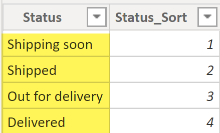
The Statuses table has a unique value for each shipping status and a status sort column. The status sort column is used to sort the shipping status by the shipping lifecycle (chronological order) rather than sorting the shipping statuses alphabetically. You can read more about “sort by” at this link.
In our example, we are assuming that each order goes through four shipping statuses, as per the sequence below:
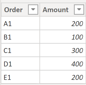
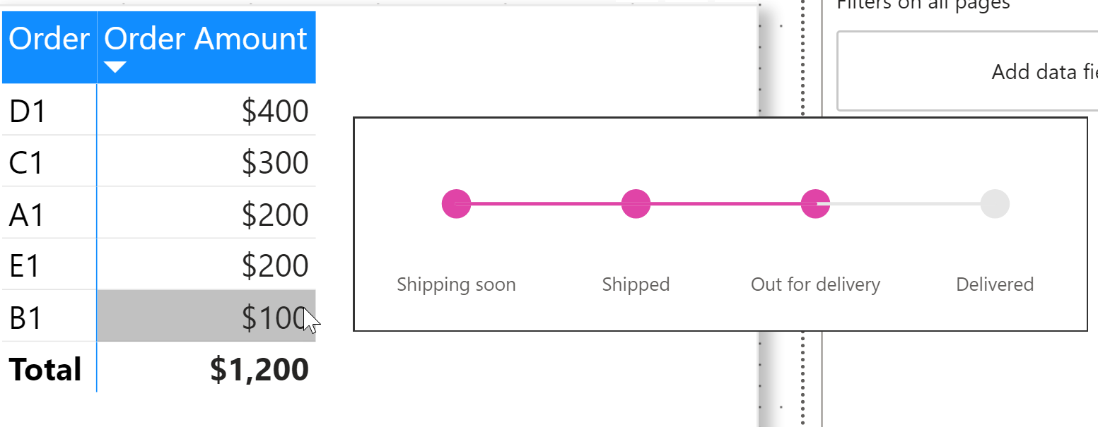
The next table is the Orders table, which is just simple a list of the orders and their respective order amounts. In our example, we have five orders as seen below.
The Order Status table contains the shipping status for each order. Each row represents the shipping status of a certain order at any given moment. This table will be the one driving the logic to use the Amazon-esque shipping status. Let’s have a quick look at the data in our Order Statuses table:
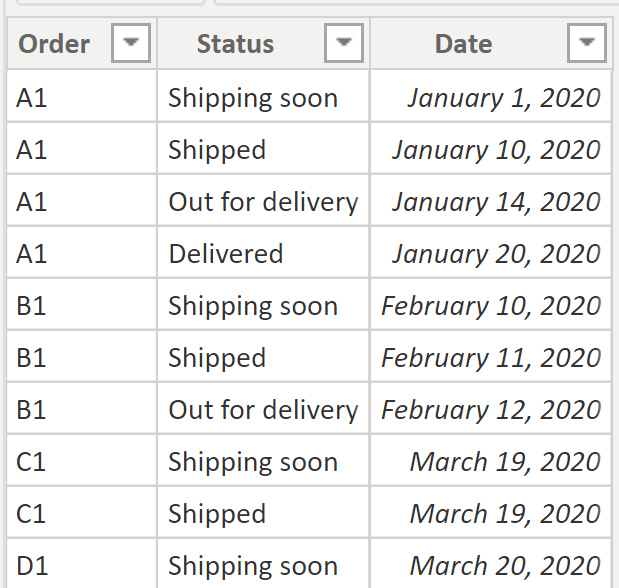
In the Order Status table, we are just storing the shipping value; in a real scenario, we would probably have a shipping status key, but that won’t have any impact on our final output here so we can skip it. If we had a shipping status key, the only that thing that would need to be changed would be to make the relationship between the Order Statuses and Statuses tables based on the shipping status key column.
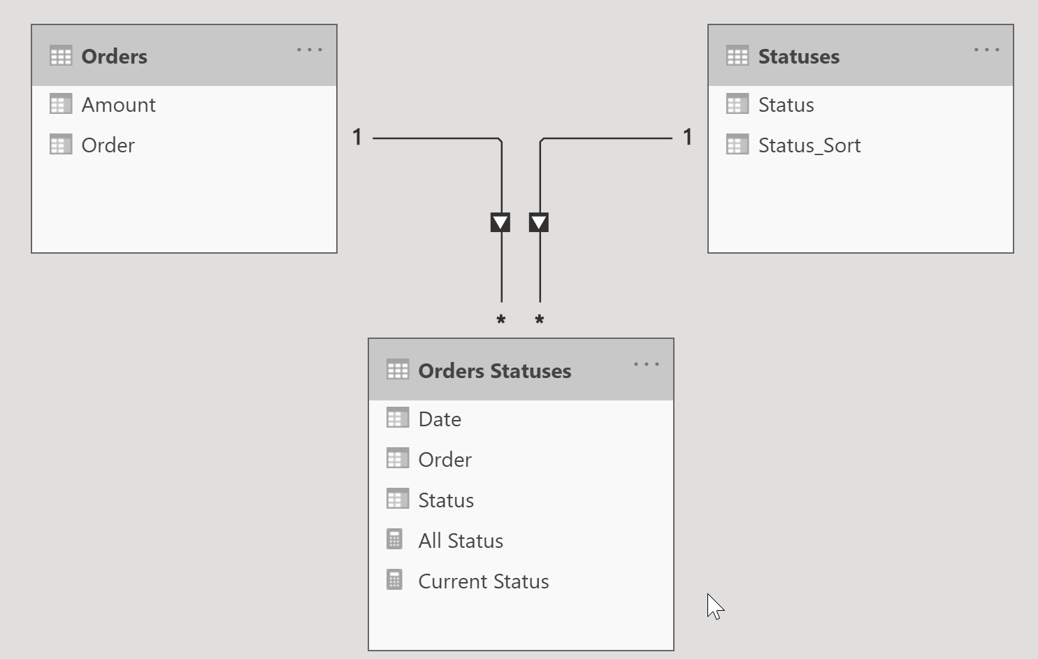
Let’s take a quick look at the relationship diagram for this model. It’s pretty straightforward: one order can have more than one shipping status and one status can have multiple orders.
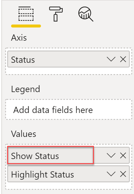
Now that we have good understanding of our tables and their relationships, we can move into the fun part! To visualize the Amazon-esque shipping status, we will need to add two measures into our model. These simple measures will be used on a line chart visual in order to give us the look and feel we we want.
Measure 1: The Show Status measure will be used to show the grey line and circles for the shipping status. If an order is selected, the measure will return a fixed value of 1, otherwise it will return a blank value. This measure is essentially used to visualize the grey shipping status line and circles.
Show Status =
VAR _SelectedOrder = SELECTEDVALUE ( 'Orders'[Order] )
RETURN
IF ( NOT ISBLANK ( _SelectedOrder ),
    1
)
Measure 2: The following Highlight Status measure will return a fixed value of 1 based on each shipping status of the order, which is in turn based on the current row context of the status from the Statuses table. This measure is essentially used to visualize the highlighting of the shipping status line and circles depending on where to the order is in the shipping status timeline.
Highlight Status =
VAR _SelectedOrder = SELECTEDVALUE ( 'Orders'[Order] )
VAR _orderStatus =
IF ( NOT ISBLANK ( _SelectedOrder ),
//find out if current selected order has row(s) filtered on status in the current row context
  CALCULATE (
        COUNTROWS ( 'Orders Statuses' ),
        TREATAS(
            VALUES ( 'Statuses'[Status] ),
            'Orders Statuses'[Status]
        )
    )
)
RETURN
--if no row found then return blank else return 1 to highlight the status in the visual
IF ( NOT ISBLANK ( _orderStatus ), 1 )
Now let’s put everything together. Create a tooltip page with a line chart that will be used to show the shipping status of the order. To learn more about how to create a report tooltip page, refer to this link.
Here are the steps to create a tooltip page:
- Under page information, turn on Tooltip.
- Set the page size to a custom size of 414×120.
- Add a line chart visual.
- On the x-axis, add the Status column from the Statuses table.
- Under values, add the Show Status and Highlight Status measures.
🤚
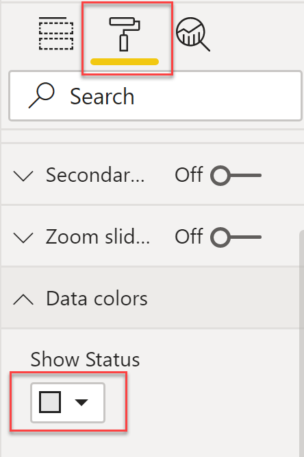
The sequence of these measures in the values section of the line chart is very important. Make sure that the first measure in the values section is Show Status. Also, on the formatting pane, change the data colour for this measure to grey.
I then added a page that has two visuals – a bar chart and a matrix, as you can see in the video – and assigned the previously created report tooltip page as the tooltip for these visuals. Voila – as we hover over a data point in our visuals, we can see the highlighted shipping status of the order!
👉 Make sure to subscribe to our blog post. In the near future, I will create something similar given we don’t have a separate table for order statuses but only the most recent shipping status available for an order.
How to show the sum of non-selected categories grouped together as "Other" category in visuals

I recently came across an interesting problem regarding how you can show the sum of values of certain selected categories as separate bars in a bar chart – but with the sum of all the non-selected categories being grouped together in an “Other” category/bar. If you take a look at the above video, you can see that as I select various categories the value for the “Other” bar is changing (the last bar). It also shows you the difference between the Total Sales and all the selected categories. If all the categories are selected (or no category is selected), then the “Other” bar disappears from the visual.
The particular business use case is that when there are too many categories, visuals can get very cluttered. I wanted to come up with a solution for this problem and I came up with this method to show only selected categories as individual bars with the rest of categories summed together in a separate – “Other” – bar in the visual. This method isn’t only applicable to bar charts – you can use it in any visual!
Let’s first look at our sample data and then the solution. The following sample data contains only three columns: Category, Sales, and Category Sort. The Category Sort column is used to sort by column for the Category column .

First and foremost part of the solution is to create a table with distinct Category values and add a record with Other as category value and this will be used to show sum of all non-selected categories, See screen shot below. I gave the sort order value for Other row to 999999, big enough number that it shows up at as the last value in the visuals, if we want Other to be the first row in the visual, I will set the Category Sort value to like negative 1 (-1).

Make sure this Category table doesn’t have relationship with your main data table.
I added following measures to make the calculation work, I created multiple measures but all this can be collapsed into one, my performance preference is to create separate measures, so that measures can be recycled where possible.
Sum Sales is a base measure.
Sum Sales = SUM ( Data[Sales] )
Sum All is a measure used to get us Total Sales regardless of selection of Categories.
Sum All = CALCULATE ( [Sum Sales], ALL ( Data[Category] ) )
Sum Others is a measure to show what value we have for non-selected categories, in other case, what value we will see in Other category when we will visualize our data.
Sum Others = [Sum All] - [Sum Sales]
Sum Sales and Others is the core measure which we will use in the visual, I have added the comments in the measure to explain what each row in the measure is used for.
Sum Sales and Others =
VAR __valueOther = "Other" --variable to store the value for "Other" so that we have it at one place to use in the DAX
VAR __selectedCategory =  --create a table of selected categories and append "Other" as an extra row
UNION (
    VALUES ( Data[Category] ),
    { __valueOther }
)
RETURN
IF ( MAX ( Category[Category] ) = __valueOther,  --check if current value is "Other"
    IF ( [Sum Others] > 0, [Sum Others] ), --if condition to suppress other value in case all the categories are selected,
    CALCULATE (
        [Sum Sales],
        //TREATUS is used to filter data table
        TREATAS  (
            INTERSECT ( VALUES ( Category[Category] ), __selectedCategory ),  --get list of categories that are selected
            Data[Category]
        )
    )
)
In above measure, if want to show 0 value for Other if all the categories are selected then remove IF condition line in the measure and just simply use Sum Others measure.
Since we have all our measures in places, we will visualize the data. Let’s add a slicer for Category and make sure the Category column in this case is used from your Data Table not from Category Table.
Add a Stacked Column Chart or any other visual you would like to see. On X-Axis, put Category from Category Table and put Sum Sales and Others measure in Values section.

👉 Make sure on X-Axis, put Category from Category Table, not from Data Table.
and that’s it, as you can see at the start of the post, Other bar value will change based on the selected categories. I hope you can leverage this technique to meet your business needs. Let me know what you think. Share your thoughts.
How to set default value of single select slicer using RLS?
I have been wanting to start writing my own blog posts for around a year now in order to share my knowledge and experience – and I have finally gotten around to writing my first blog post! In this blog post, I will be discussing a question that was posted on the Power BI Community forum. If you are not aware of what the Power BI Community forum is, I highly recommend that you check it out at community.powerbi.com. It is a great place to learn from others, ask your own questions, learn about best practices, and hone your skills in Power BI.
Now let’s get back to the question at hand: “How do you reset the Single select slicer when using Row Level Security (RLS)?” Before we get into the solutions, let’s first look at the Single select slicer and what it does.
Single Select Slicer
Single select is an option in the slicer settings that allows the user to select only one value in a slicer. Once “Single select” is turned on, the user must always have one default value selected in the slicer – you cannot have no values selected in the slicer.
To turn a slicer into “Single select,” go to the “Format” tab and toggle “Single select” to “on” (as depicted in the image below).

So, what are the issues when using a Single select slicer with RLS? Here is the problem that a user posted on the Power BI Community forum:
I have a report based on RLS with two slicers one Department and second Jobs. Users can see only jobs which they belong to theirs department. Everything works just fine (for example user A can see jobs belong to Dept 10 and user B can see jobs belong to dept 11) The problem starts when I modify the Job slicer to single select for example if I publish the report I need to select at least one job which belong to department that only users with RLS can see. For example, I published a report with Department = ALL and Job 10 When user B try to browse the report he / she see an empty report because theirs department is not on theirs RLS list.
My question – how do I reset the single select slicer so on the first time user can see theirs department and jobs?
Here is the link to the post on community forum.
One important thing that I want to mention is that I will not be explaining Row Level Security in this blog post. If you want more information regarding RLS, I will share some resources at the end of this post that explain what it is and how you can set it up.
Now let’s discuss the solution that I came up with. First, let’s look at the very simple data model. There is one table called Investment, containing a “Team” column and some other number columns, and one table called Users, containing a “User” column along with which “Team” data they can see.
The image below depicts the data model:

Note: We don’t want to set any relationship between these two tables.
Below is what our Users table looks like – we have a special row in this table where both the “Team” and the “User” value is ALL. This row will later be used for our solutions, but for now it is important to know that there is a special row in our Users table.

First, we are going to add a simple measure to identify our special row (ALL) in the Users table:
ALL Team = IF ( MAX ( Users[Team] ) = "ALL", 1, 0 )
The next step is to add a role for RLS that identifies which users can see which teams. This utilizes the logic that every user can see the ALL row. There are seven steps to add this simple RLS filter:
- Go to “Modelling” tab
- Click “Manage roles”
- Click “Create”
- Enter role name
- Select Users table
- Enter role formula
- Click “Save”

Once we have created our role for RLS, we can quickly test it by dropping a slicer visual onto the canvas and adding the “Team” column from the Users table onto the slicer. To test a role, click “View as” on the “Modelling” tab and enter the user name. It will list only those teams which the selected user can see.
An important point to note here is that you will always see an “ALL” option in the slicer – it doesn’t matter which user is currently looking at the data.

Now in the next step we are going to filter our Investment table based on the current user. To achieve this, we will create a measure that will show only those teams which the currently selected user can see.
Filter Team =
VAR __isAllTeamSelected = [ALL Team]
RETURN
CALCULATE (
    COUNTROWS( Investments ),
    KEEPFILTERS(
        TREATAS (
            SUMMARIZE (
                FILTER(
                    ALL ( Users[Team] ),
                    IF ( __isAllTeamSelected = 1, TRUE(), Users[Team] = MAX ( Users[Team] ) )
                ),
                Users[Team]
            ),
            Investments[Team]
        )
    )
) + 0
Let’s look what above measure is going to return. It is going to give us count of rows from Investment table for only those teams which a user can see based on Users table, and if a user cannot see a team, above measure will return a Zero value and in case “ALL” value is selected we will get row count for each team a user can see.
If ALL value selected in the slicer

If single team selected in a slicer, only that team shows row count, other teams has Zero value.

We will use this measure as visual level filter – see screen shot below to exclude teams which we don’t want to show, or in other words only show selected team, and case of “ALL” we will see all the teams of the user.

So how does this fit in our original problem. Didn’t I mention that special row with team “ALL” is important as this row will be always available regardless what user is viewing the data. In our “single select” slicer we will select “ALL” as default selection and regardless what user is looking at the data, they will always see their teams with “ALL” as default selected team.
Power BI file is attached with above solution. As I’m always learning, looking forward to your valuable feedback or share how you will solve it.
About the author
Parv Chana is a BI Architect and Consultant with over 20 years of industry experience. He runs a small consulting company, PeryTUS IT Solutions, where he implements Power BI solutions for his clients, which range from small to large enterprises. He has experience working within a wide variety of industries and has deployed many unique solutions to solve his clients’ BI needs. He is a Microsoft Data Platform MVP and has been working with Power BI ever since it was made available in 2015.
His areas of focus include implementing end to end Power BI solutions (from data modelling to visualization), analyzing existing Power BI solutions, helping organizations follow best practices for scalable BI models, and providing training to help his clients achieve their BI goals.
Useful Links
Learn more about RLS here.
Link to USERNAME() and TREATAS function