In this blog post, I’m going to talk about how we can create a shipping status in Power BI that visually shows the selected order’s shipping status. This will have look and feel similar to shipping statuses on websites like Amazon, providing a clear way to see your order’s status visually!
Before we begin, let’s first understand the data. We have three tables in this model:
- Statuses
- Orders
- Order Statuses
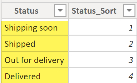
The Statuses table has a unique value for each shipping status and a status sort column. The status sort column is used to sort the shipping status by the shipping lifecycle (chronological order) rather than sorting the shipping statuses alphabetically. You can read more about “sort by” at this link.
In our example, we are assuming that each order goes through four shipping statuses, as per the sequence below:
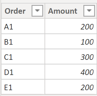
The next table is the Orders table, which is just simple a list of the orders and their respective order amounts. In our example, we have five orders as seen below.
The Order Status table contains the shipping status for each order. Each row represents the shipping status of a certain order at any given moment. This table will be the one driving the logic to use the Amazon-esque shipping status. Let’s have a quick look at the data in our Order Statuses table:
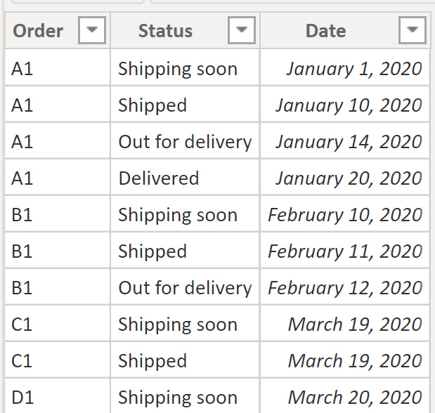
In the Order Status table, we are just storing the shipping value; in a real scenario, we would probably have a shipping status key, but that won’t have any impact on our final output here so we can skip it. If we had a shipping status key, the only that thing that would need to be changed would be to make the relationship between the Order Statuses and Statuses tables based on the shipping status key column.
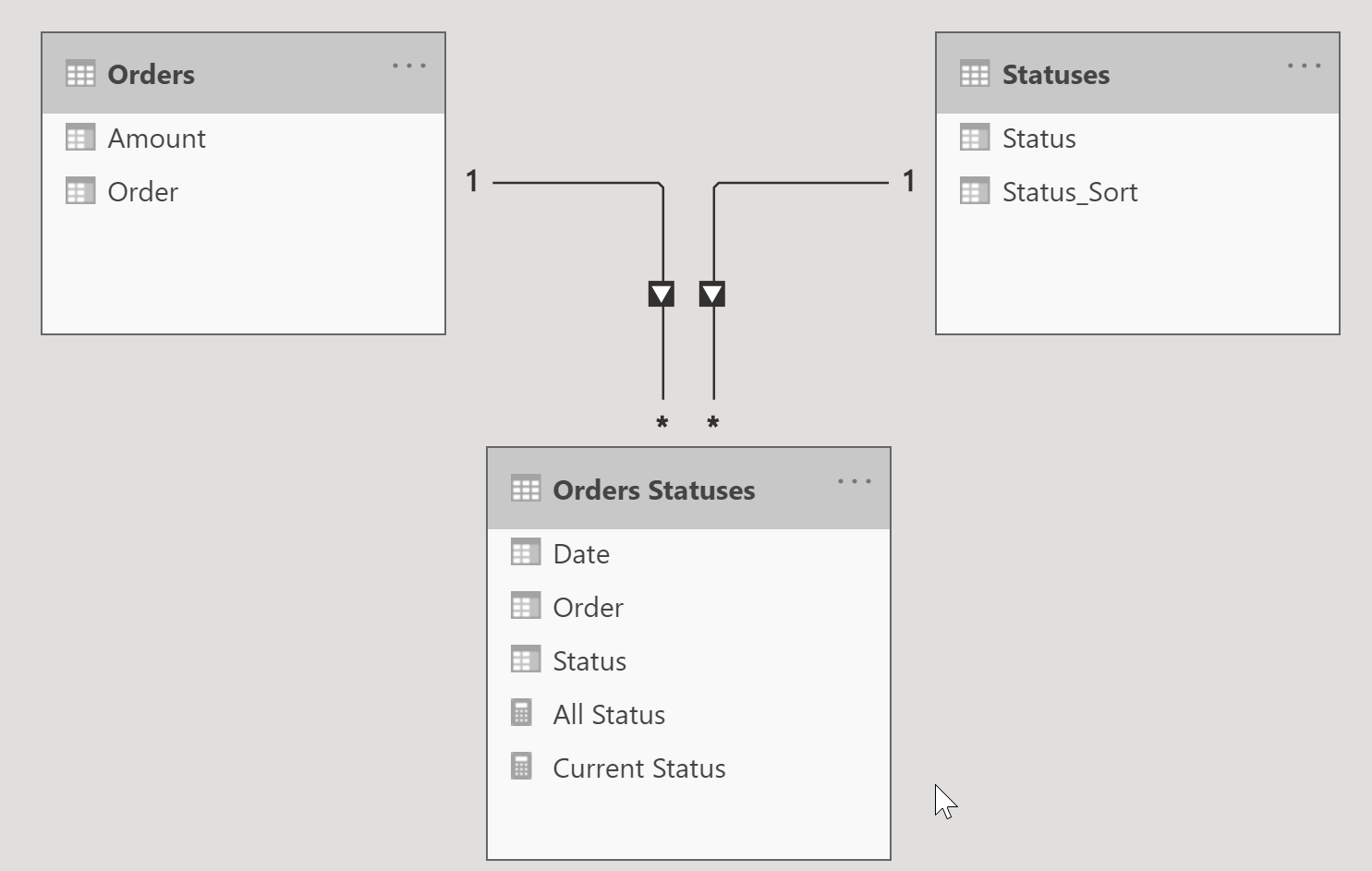
Let’s take a quick look at the relationship diagram for this model. It’s pretty straightforward: one order can have more than one shipping status and one status can have multiple orders.
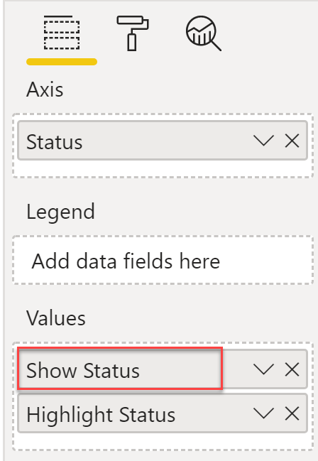
Now that we have good understanding of our tables and their relationships, we can move into the fun part! To visualize the Amazon-esque shipping status, we will need to add two measures into our model. These simple measures will be used on a line chart visual in order to give us the look and feel we we want.
Measure 1: The Show Status measure will be used to show the grey line and circles for the shipping status. If an order is selected, the measure will return a fixed value of 1, otherwise it will return a blank value. This measure is essentially used to visualize the grey shipping status line and circles.
Show Status =
VAR _SelectedOrder = SELECTEDVALUE ( 'Orders'[Order] )
RETURN
IF ( NOT ISBLANK ( _SelectedOrder ),
    1
)
Measure 2: The following Highlight Status measure will return a fixed value of 1 based on each shipping status of the order, which is in turn based on the current row context of the status from the Statuses table. This measure is essentially used to visualize the highlighting of the shipping status line and circles depending on where to the order is in the shipping status timeline.
Highlight Status =
VAR _SelectedOrder = SELECTEDVALUE ( 'Orders'[Order] )
VAR _orderStatus =
IF ( NOT ISBLANK ( _SelectedOrder ),
//find out if current selected order has row(s) filtered on status in the current row context
  CALCULATE (
        COUNTROWS ( 'Orders Statuses' ),
        TREATAS(
            VALUES ( 'Statuses'[Status] ),
            'Orders Statuses'[Status]
        )
    )
)
RETURN
--if no row found then return blank else return 1 to highlight the status in the visual
IF ( NOT ISBLANK ( _orderStatus ), 1 )
Now let’s put everything together. Create a tooltip page with a line chart that will be used to show the shipping status of the order. To learn more about how to create a report tooltip page, refer to this link.
Here are the steps to create a tooltip page:
- Under page information, turn on Tooltip.
- Set the page size to a custom size of 414×120.
- Add a line chart visual.
- On the x-axis, add the Status column from the Statuses table.
- Under values, add the Show Status and Highlight Status measures.
🤚
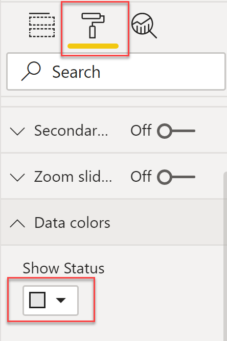
The sequence of these measures in the values section of the line chart is very important. Make sure that the first measure in the values section is Show Status. Also, on the formatting pane, change the data colour for this measure to grey.
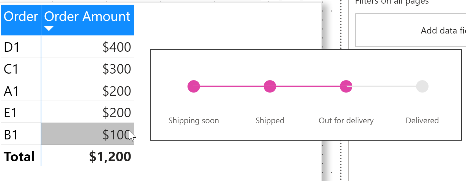
I then added a page that has two visuals – a bar chart and a matrix, as you can see in the video – and assigned the previously created report tooltip page as the tooltip for these visuals. Voila – as we hover over a data point in our visuals, we can see the highlighted shipping status of the order!
👉 Make sure to subscribe to our blog post. In the near future, I will create something similar given we don’t have a separate table for order statuses but only the most recent shipping status available for an order.