
I recently came across a requirement to show a message or an image in a visual, when a visual ends up as a blank depending on the filters/slicers applied. This can happen when a user filters data and no value is returned for the filtered data — the visual will appear blank. With this simple conditional formatting technique, you can keep your end-users more informed and keep your report more user friendly by displaying some sort of message on the visual rather than leaving it blank.
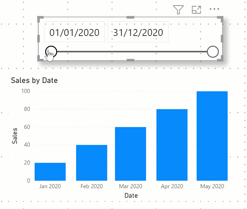
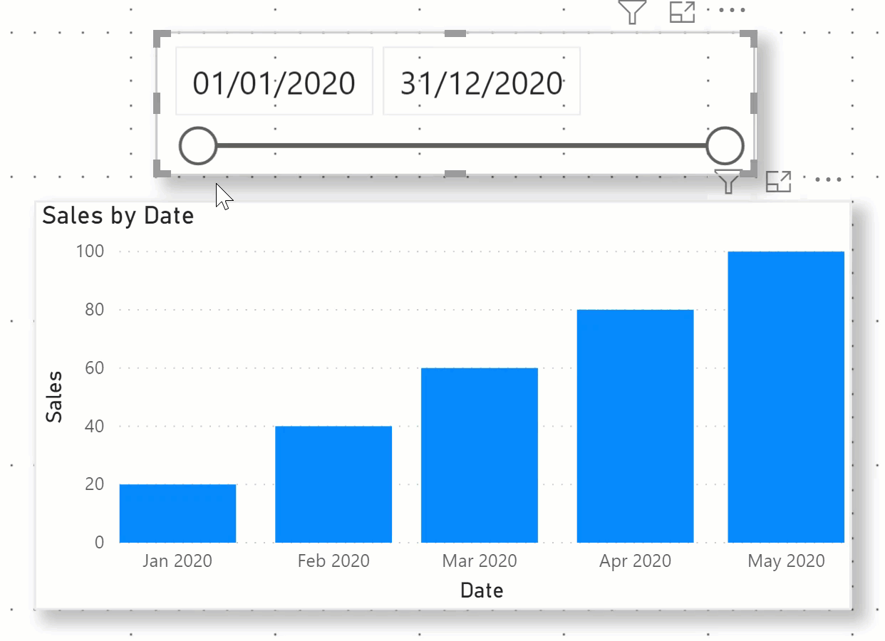
For example, take a look at this bar chart that shows sales by month. The user can select a date range in the slicer. If a user selects a period that doesn’t have any sales, the bar chart will appear blank (as shown in the image below). So, in this case, the request was to show some sort of message or image stating that there is no data based on the filter selection rather than just leaving the visual blank.
I came up with a solution by setting up conditional formatting that uses measures with transparency levels. Let’s look at how colour settings and hex codes work first. You can use measures in conditional formatting that have hex code values (which are usually 6 characters long). For example for the colour white, the hex code is “#FFFFFF” and for the colour black, the hex code is “#000000.” To set the transparency level, you need to add two more characters to the end of your hex code. For 0% transparency, the value is “00” and for 75% transparency, the value is “BF.” Therefore, if you want to set the transparency level for black to 75%, the hex code will be “#000000BF.” Similarly, for 0% transparency the code would become “#00000000.”
Let’s take a look at how using these hex codes in measures can help us to get to our solution.
Solution 1: Use the card visual and conditional formatting.
Here, we want to show a text message when no data is found for the visual, depending on the filter selection. To achieve this, I added two measures. One measure is to show the message and the other measure is to set the colour (with transparency), depending on whether there is data to show.
No Data Found Message = "No data found for selected period."In the colour measure, we are checking if the Sales measure (which is simply a sum of the Sales amount) is blank. If it is blank, we want to set the hex code for the colour measure to the colour red so that our text will be red in the KPI card. If the Sales measure is not blank, then we want to add 100% transparency to our colour so that it isn’t visible. This is done by adding “00” at the end of the hex code.
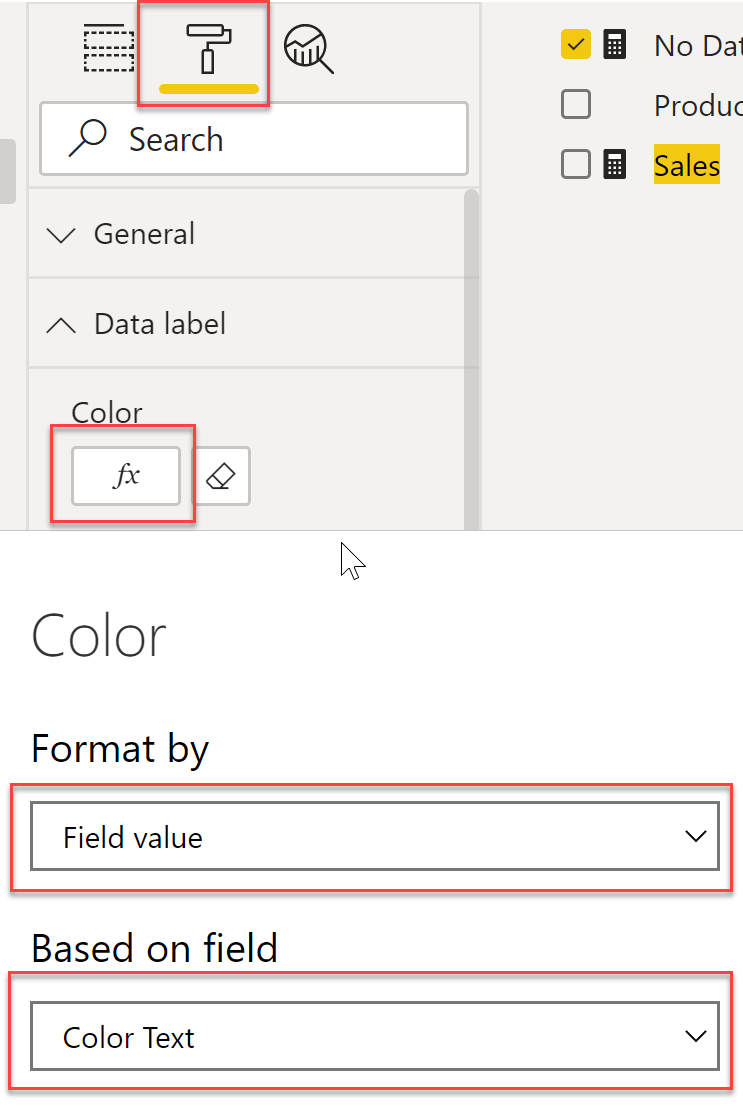
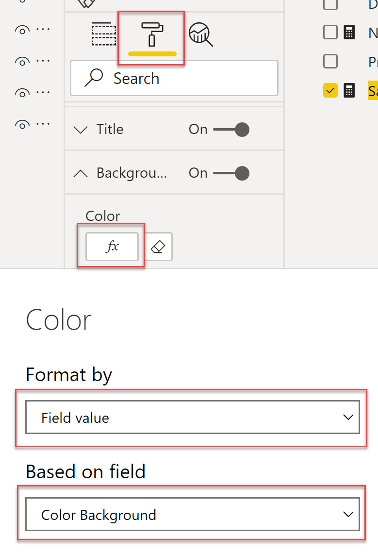
Color Text = "#D64550" & IF ( NOT ISBLANK ( [Sales] ), "00" ) To finally set up everything, I added a KPI card. I set the value of the KPI card as the “message” measure. Then, under “Data label” for the KPI card, I went to conditional formatting under “Color” and used the Color Text measure in “Based on field” (see image below). Also, I turned on maintain layer order which you can read more about here.
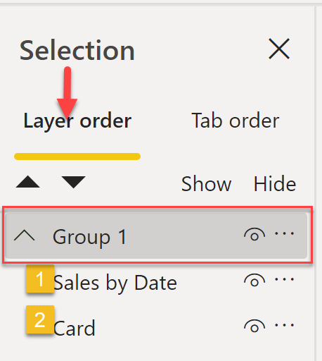
I added a bar chart and made it the same size as our KPI card. I also set the X and Y position for the bar chart to the same positions as the KPI card. In the end, our bar chart is layered on top of the KPI card. I selected both the KPI card and bar chart visual and grouped these visuals. Check out this link to learn more about grouping.
Make sure that the bar chart is the first visual in the group and then the card visual should be the second visual.
Once this is all done, when a user slices the data and no sales are found in the selected period, we will see the message! Otherwise, we will see the bar chart as normal.
Solution 2: Show the image and change the background colour.
To achieve this solution, I added one measure to control the background colour for our bar chart visual.
I created a background colour measure that sets the background to white as a default. If no sales are found for the selected period, I added 100% transparency to the colour by adding “00” to the end of the hex code so that the background is not visible.
Color Background = "#FFFFFF" & IF ( [Sales] == BLANK(), "00" )To set this up, I added an image visual and then turned on maintain layer order. I then added a bar chart visual and layered this bar chart on top of the image visual. Now, group these visuals and make sure that the bar chart is the first visual in the group — similar to the grouping we saw in the previous example.
For the last step, we need to set the background colour. Then, under “Background” for the visual, I went to conditional formatting under “Color” and used the Color Background measure in “Based on field” (see image below).
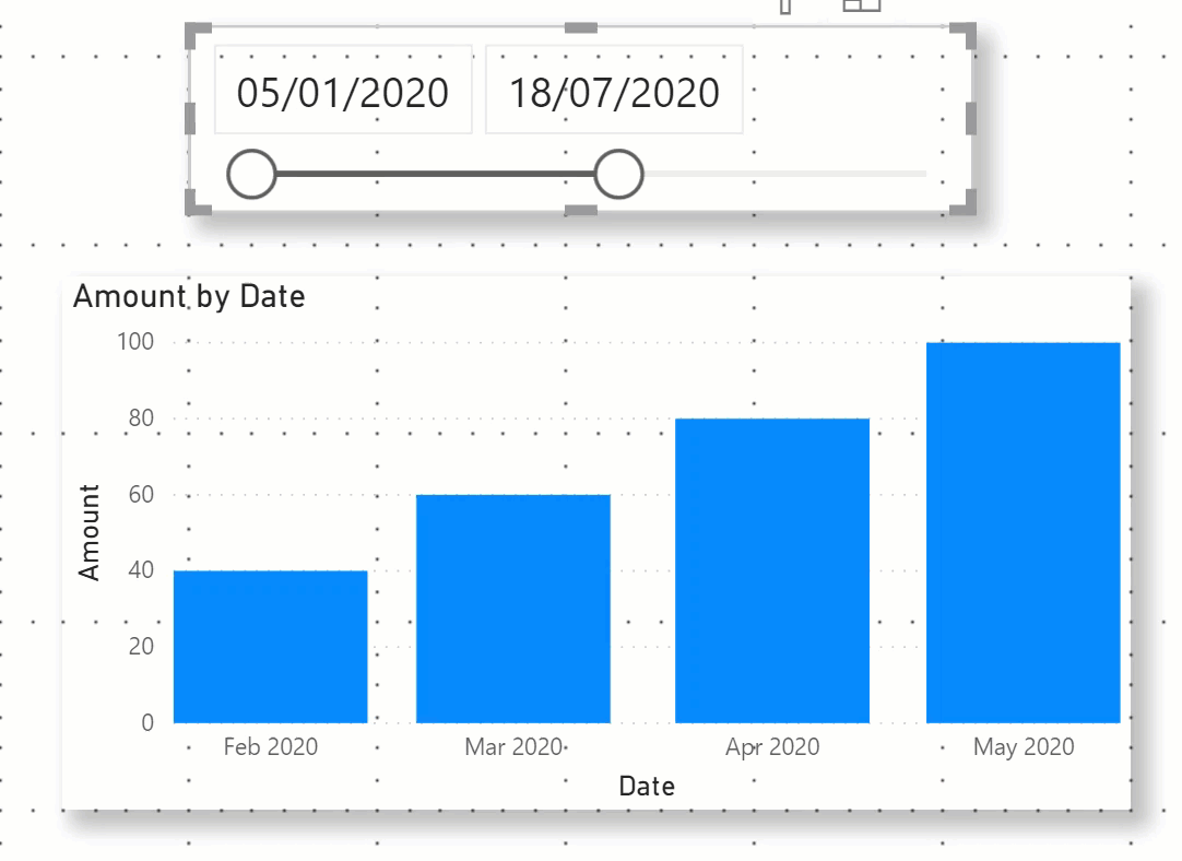
And now, when the user slices the data and there is no sales amount for the selected period, we will see the image! Otherwise, we will see the bar chart as normal.
As you can see, we can really achieve a lot using colour transparency and the above techniques. I hope you find it useful — please share your feedback with me!


No comment yet, add your voice below!