
When working with Power BI, we have probably all done some sort of time intelligence. For example, comparing current year sales with previous year sales, comparing the current quarter with the previous quarter, etc. Time intelligence is very common — and important — in any BI tool. Power BI has around 44 DAX time intelligence functions, allowing us to perform a wide variety of calculations. In this blog post, I will show you how to use time intelligence in a particular technique that will help you improve your report’s user experience. We want to figure out how to show the actual years in the legend of a visual, rather than the measure names of the measures being used to filter the data we want, based on a slicer selection.
What we are trying to achieve in this blog post?
Today, I’ll be sharing something that I have always wanted to demonstrate! Let’s consider a simple example: we have a Year slicer and we want to compare sales of the selected year with sales of the previous year. If no year is selected, we want to take the current year and compare it with the previous year. As of writing this post in 2021, if no year is selected in the slicer then we will compare 2021 with 2020. If the year 2020 is selected in the slicer, we will compare 2020 with 2019, and so forth.
Acheiving this is pretty straightforward. We just need to ensure that we have the Date dimension in our model. Don’t worry, you can easily add this dimension to your model! Simply check out my post on this topic here. From this Date dimension, we will add two measures: Sales (you can call it Selected Year Sales, This Year Sales, etc.) and Sales PY (you can call it Previous Year Sales, etc.).
Sales= SUM ( Sales[ExtendedAmount] )
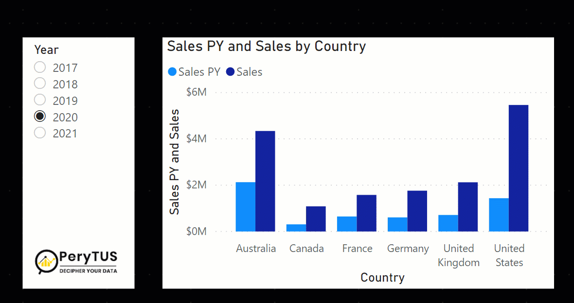
Sales PY = CALCULATE ( [Selected Year Sales], PREVIOUSYEAR ( 'Calendar'[De leate] ) ) As you can see in the image below, the slicer and the visualization look good. If we select a year in the slicer, we will see sales of that year and the previous year. If no year is selected, then the slicer takes 2021 as a default year and compares it with the year 2020. However, you probably noticed that the legend only shows the measure names — this isn’t the most user-friendly design. It could quickly get confusing if the years aren’t clearly displayed in the visual.
PS: In this example, I’m not comparing the same period last year, just for simplicity I’m taking full-year sales since that is not the purpose of this blog post.
So, then what’s wrong with the above approach if it’s working as expected? Well, nothing is necessarily wrong, but the legend only shows the name of the measure rather than the year. The legend doesn’t change based on the selected year, which is what we will now solve. Of course, we could add a dynamic title along the lines of “Comparing 2020 vs 2019” (depending on what year you chose). A dynamic title is fine, but it doesn’t fix the issue with actually showing the year in the legend.
Here is the solution to show the selected years in the legend:
First, add a new column in the Sales table and call it OrderYear. I added this column using Power Query and it will also be used later in our visualization.
Next, add a new measure called Sales New with the following expression (the code is explained in detail below):
Sales New =
//get selected year, if no year is selected or more than one year is selected
//then get the most recent year from the table
VAR __selectedYear =
    SELECTEDVALUE (
        'Calendar'[Year],
        YEAR ( TODAY() )
    )
//get previous year by simply substracting one from the selected year
VAR __prevYear = __selectedYear - 1
RETURN
    CALCULATE (
        [Sales],
        //turn off the relationship between the date and fact table
        CROSSFILTER ( 'Calendar'[Date], Sales[OrderDate], NONE ),
        KEEPFILTERS (
            TREATAS (
                { __selectedYear, __prevYear },
                //apply filter to the fact table on the selected and prev year
                Sales[OrderYear]
            )
        )
)- __selectedYear variable: This variable stores the value of the selected year from the slicer. If no value is selected, or multiple values are selected (in the case of a multi-select slicer), then it will take the current year.
- __prevYear variable: This variable simply subtracts one (as in one year) from the __selectedYear variable.
- CALCULATE expression:
- [Sales] is an existing measure. It is simply a sum of the ExtendedAmount column (a column in my model).
- By passing the value NONE to the CROSSFILTER function, we are disabling the relationship between the Calendar and Sales tables so that when a year is selected in the slicer, the Sales table isn’t filtered. If there is no relationship between the Calendar and Sales table, then we don’t need the CROSSFILTER function in our expression.
- TREATAS filters the Sales table on OrderYear (the new column we added) for the selected year and previous year.
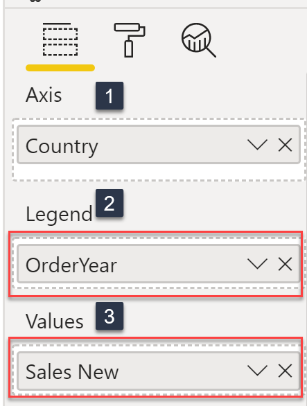
Now let’s see the result! To do so, I created a simple Column Chart visual. See below for the steps I used to create the visual:
- Country column on Axis.
- OrderYear on Legend (this is important).
- Sales New measure on Values.
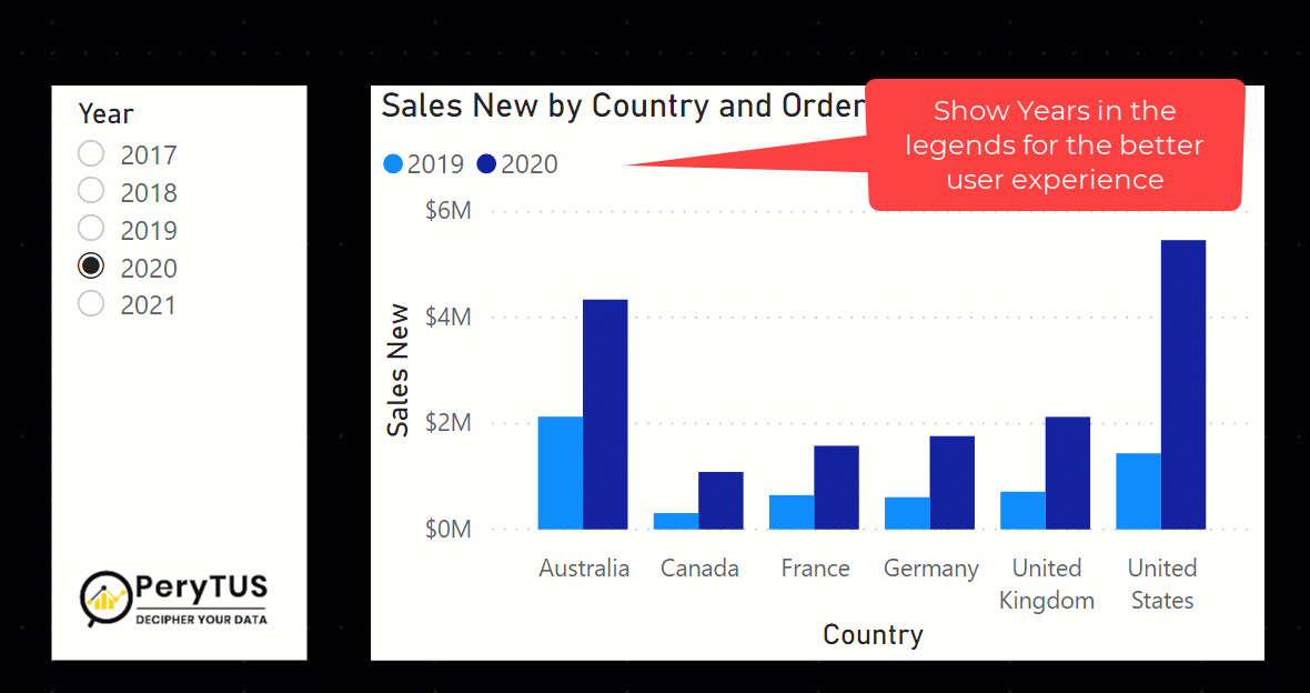
Here is our final output! We now have the legend displaying the years instead of showing the measure names (Selected Year and Previous Year). I believe this leads to a much better user experience.
Conclusion:
As you can see, we really can achieve a lot just by using some simple DAX. I really enjoyed writing this blog post because I think it is very relevant and applicable technique! I hope you find it as useful as I do. Please leave any comments, questions, or suggestions for future blog posts below. I always appreciate your feedback.


No comment yet, add your voice below!