Introduction:
The recent heatwave in Western Canada (the heat has broken numerous records, check out the news here) has put a halt to my ability to go out for my daily run/walk. To make use of this extra time indoors, I decided to write this blog post based on a question that was posted on the Power BI community forum. We will be using calculation groups in conjunction with inactive relationships to more easily visualize data based on different date columns/types in a visual, based on the user’s slicer selection.
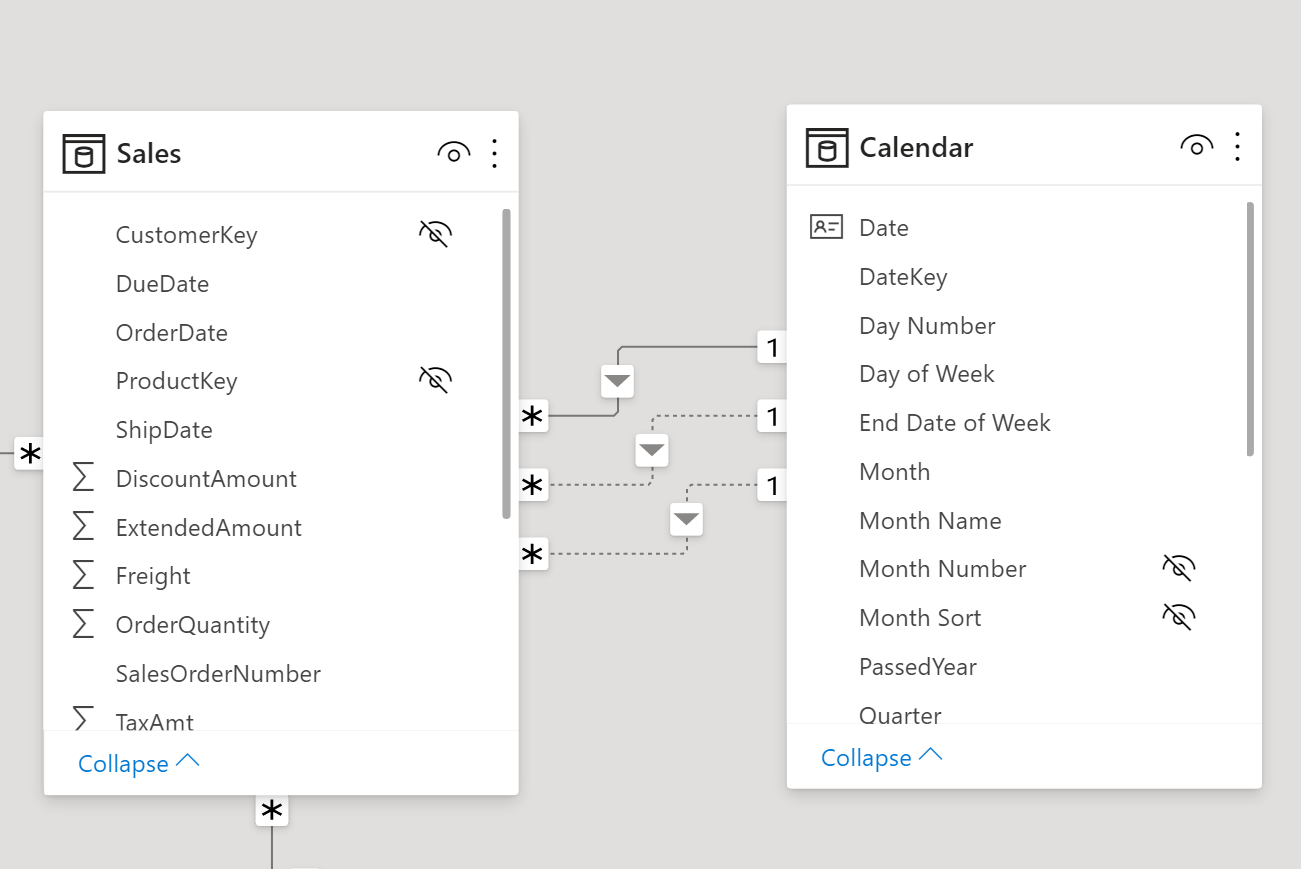
To make this question easy to understand, we will use an example of a typical Sales table that has many date columns: Order Date, Ship Date, and Due Date. All these date columns have a relationship with the Calendar table. You can create a Calendar table in your model by following my blog post regarding that topic here. As we know, in a Power BI model you can only have one active relationship between two tables and any other relations are inactive. In this example, our model has an active relationship on the Order Date column, and an inactive relationship on the Ship Date and Due Date columns.
Problem:
The task here is to change the data presented in your visual based on any of the three dates as mentioned above (Order Date, Due Date, or Ship Date), so that the data reflects the date type that you have chosen. Before the calculation groups feature was available in Power BI, we would have had to create measures for each date type. See the table below:
| Measure | By Order Date | By Ship Date | By Due date |
| Sales | Sum of Sales | Sum of Sales using USERELATIONSHIP | Sum of Sales using USERELATIONSHIP |
| Quantity | Sum of Quantity | Sum of Quantity using USERELATIONSHIP | Sum of Quantity using USERELATIONSHIP |
| Number of Orders | Distinct count of the order numbers | Distinct count of the order numbers USERELATIONSHIP | Distinct count of the order numbers USERELATIONSHIP |
Looking at the above table, if we have three measures, and three dates, we will have 3 x 3 = 9 measures in our model. If we have all the MTD/QTD/YTD measures for each of the above date types, we would have TONS of measures in our model to visualize each measure according to the different date types.
And for visualizations (before calculation groups), we would typically have buttons on the page to navigate to a different page or bookmarks to show the report by a specific date type to switch between the different date types to view the relevant data on the visual.
So, what’s new? How do calculation groups help with all this? Let’s look at the solution:
PS: I’m not going to talk about calculation groups here. There are a lot of blog posts on this topic and I will share the link at the end of this post.
Solution:
- Create a calculation group, I called it “Analyze By”
- Add three calculation items in this group:
- Order Date
- Ship Date
- Due Date
- Under each calculation item, add a measure and activate the inactive relationship using the USERELATIONSHIP DAX function.
| Calculation Item | Measure definition in calculation items |
| Order Date | SELECTEDMEASURE() |
| Ship Date | CALCULATE ( SELECTEDMEASURE(), USERELATIONSHIP ( ‘Calendar’[Date], ‘Sales’[ShipDate] ) ) |
| Due Date | CALCULATE ( SELECTEDMEASURE(), USERELATIONSHIP ( ‘Calendar’[Date], ‘Sales’[DueDate] ) ) |
Now here comes the fun part! Once the above is done, the calculation group is ready and it is time to visualize the data.
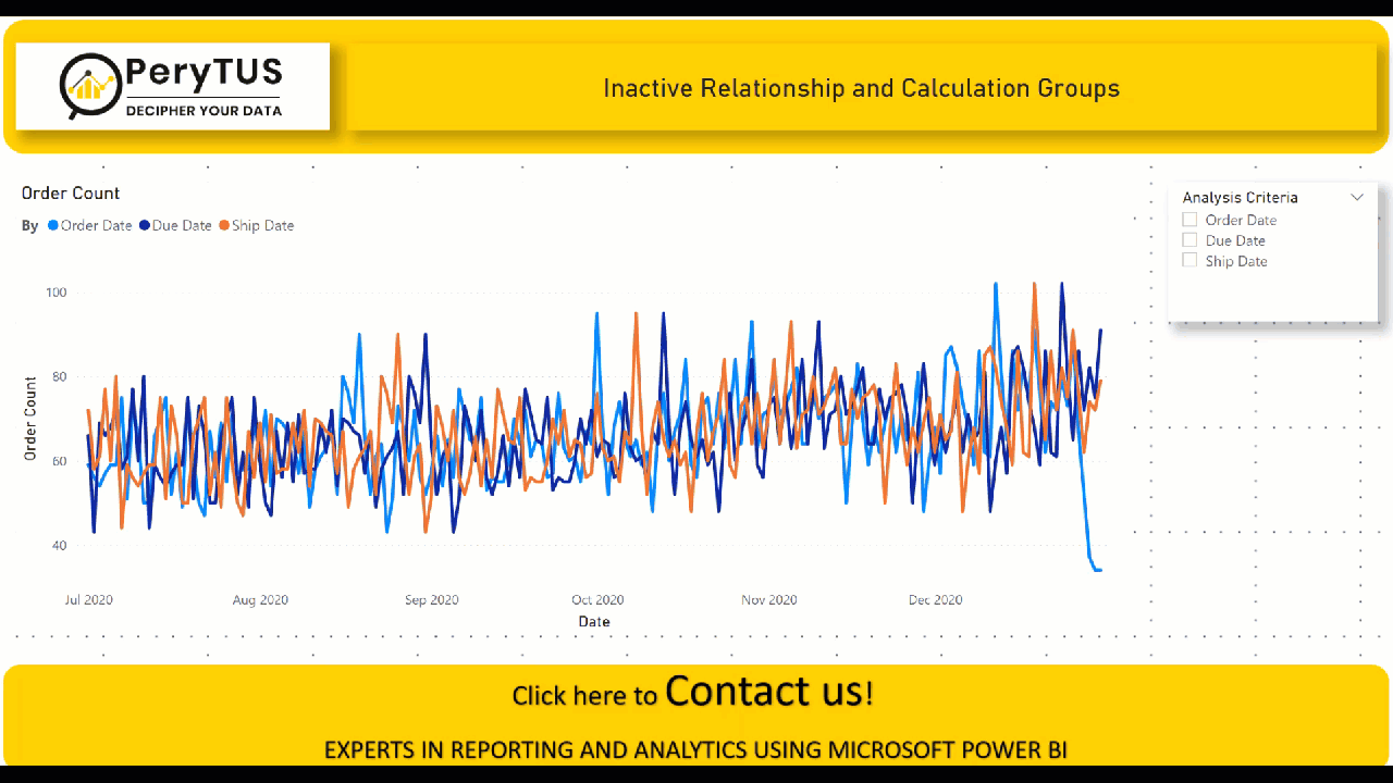
Let’s create a line chart. Use Date on the x-axis and Number of Orders on values. Added a slicer so that the user can select how they want to analyze the Number of Orders. I turned on multiple select for the slicer to compare the Number of Orders between different date types. The GIF shows that a user can see the Number of Orders based on the selection.
I hope you find this useful! In our example, we may only have three measures but calculation groups can still really help us. Using calculation groups means we don’t need to write out all the different variations of these measures for each date, and we can use any measure in our visual and then analyze it by any date type.
Next calculation groups blog post (sneak peek):
In the next part of this blog post, I will talk about how we can select different measures in the same visual based on the selected date. For example, the user will be able to select what they want to analyze, such as Sales, Quantity, and Number of Orders in a slicer. Based on this selection, the visual will show all the selected measures.
Useful Links:
Calculation groups in Analysis Services tabular models | Microsoft Docs


No comment yet, add your voice below!