
Introduction
This was a really fun problem to solve! I don’t remember exactly what triggered me to work on this problem — likely something I saw on the Power BI Community, which I highly recommend you take a look at. Let’s get into the problem statement. I have two tables: a simple table showing production by date and a calendar table. Both are related on the date column, a pretty common scenario. The goal we are trying to achieve is as follows: when a user selects one or more value in the slicer, we want to highlight that selection in bar chart visuals (as seen in the video below).

Where would something like this be used? For example, you might want to highlight certain data points and then take a screenshot to include in a report that you will be sharing with your team. This technique can draw attention to an important area of the visual that you want to emphasize.
Using DAX in the Solution
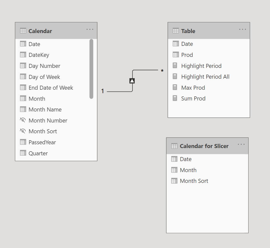
The solution is pretty straightforward. First, we need to add a disconnected table for our slicers. This ensures that our main visual is not filtered when a value is selected in the slicer. I created a table for the slicer called Calendar for Slicer using the following DAX expression. It contains three columns: Date, Month, and Month sort. If we needed another column for the slicer, for example Year, I would just include that in the following DAX expression.
Calendar for Slicer =
SELECTCOLUMNS (
    'Calendar',
    "Date", 'Calendar'[Date],
    "Month", 'Calendar'[Month],
    "Month Sort", 'Calendar'[Month Sort]
)
And here is the relationship diagram, showing that no relationships exist between this slicer table we just created and the other tables.
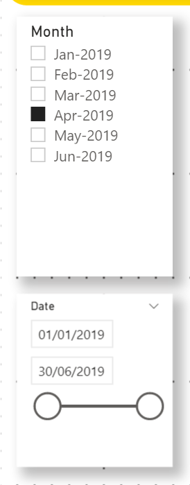
I added two slicers using the Month and Date columns from the disconnected table (Calendar for Slicer):
Now, we will work on actually highlighting the data points. To achieve this, we need to add another measure that returns the highest production value for each date for the selected period in the slicer. The reason we need the highest production value is to ensure that the highlighted area creates a box around the selected data (up to the top of the Y-Axis). Here is the measure that does the job for us. I called this measure Highlight Period.
Highlight Period =
IF ( ISFILTERED ( 'Calendar for Slicer' ), //check if calendar table is filtered
    IF (
        //check if current table date is in selected date range, if yes get the maximum value for the
        //all visible dates otherwise return 0
        COUNTROWS ( INTERSECT ( VALUES ( 'Calendar'[Date] ), VALUES ( 'Calendar for Slicer'[Date] ) ) ) > 0,
        MAXX ( ALLSELECTED ( 'Calendar'[Date] ), [Sum Prod] ) ,
        0 //we will return 0 value so that we can show all the dates on x-axis for highlight bar chart visual
    )
)
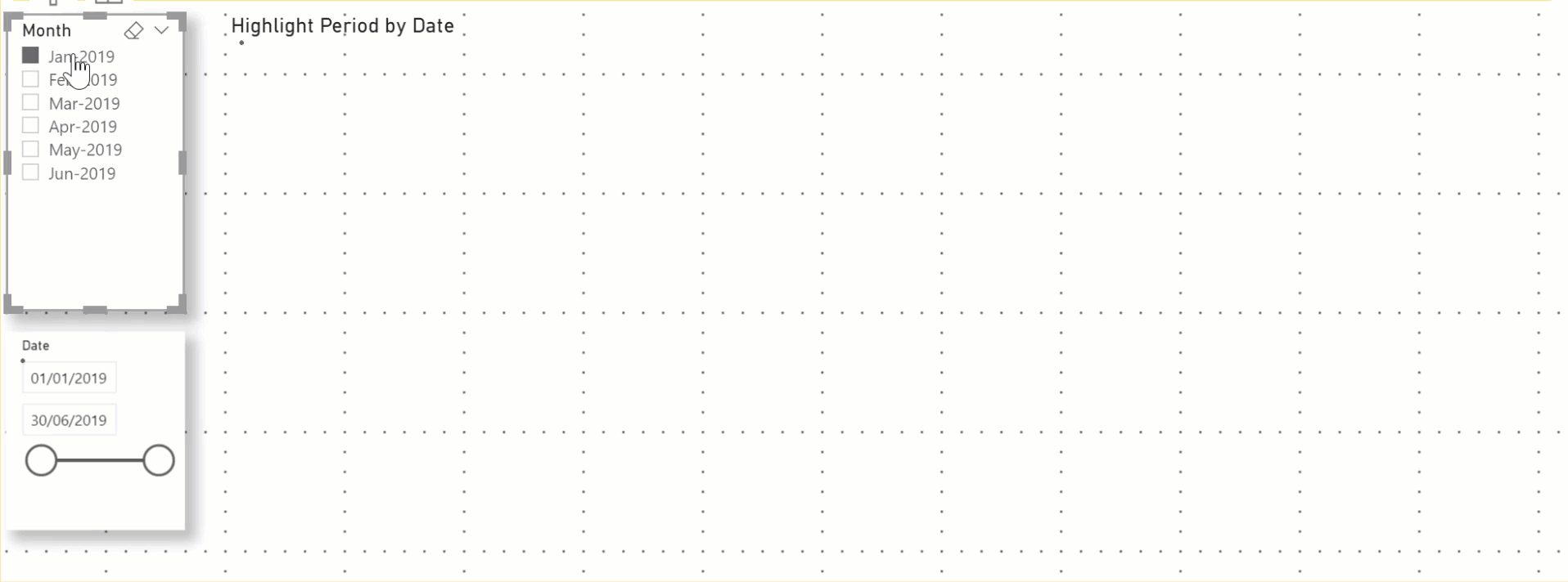
This measure checks if no value is selected in the slicer because in that case, we don’t want to highlight any data point. If this measure wasn’t present, then the full area will always be highlighted (as seen in the image below).
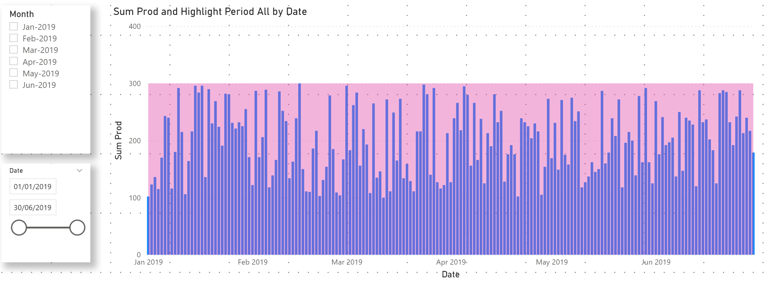
We then check which dates are selected in the slicer and return the maximum production value (highest value) for each selected date. For example, if the month of Jan 2019 is selected, it will return the highest value for each date in January. If the user selects a date range from Feb 15 to Feb 20, it will return the highest value for this date range. In other words, this is the area we want to highlight. The video below explains this visually.
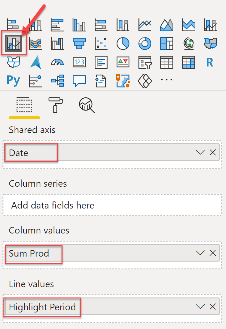
Creating the Visuals
Now that our measures are in place, it is time to assemble everything.
- Add Line and Clustered Column Chart visual
- Add Date column from Calendar table on X-Axis (Shares axis)
- Add Sum Prod measure on Column values
- Add Highlight Period on Line values
And now a few more settings on the Formatting pane under Shapes to give the final look.
- Turn on the Shade area
- Set Stoke width to 0
- Turn on Stepped
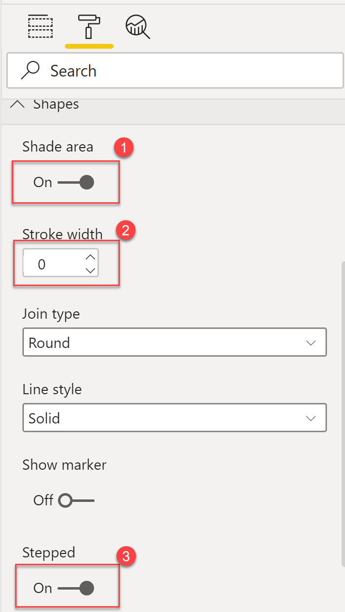
Under Data Color, I changed the colour for the line to pink ( for the highlight colour). And that’s pretty much it! Now as you select any value in the slicer, (month or date range), the area for the selected value will be highlighted. If multiple months are selected, then all the selected months are highlighted.
I hope you find this solution useful, or are maybe able to use the DAX in this solution for your other reporting needs.


1 Comment
[…] 3. Just in case the second link doesn’t work, you can find Parvinder Chana’s blogpost here […]