
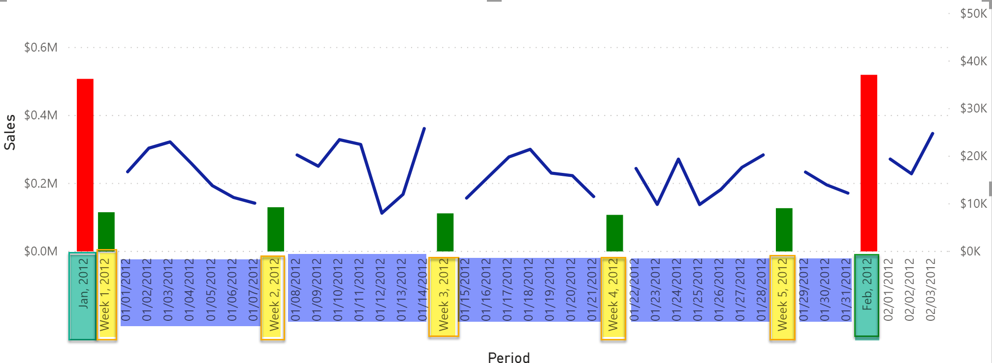
In this blog post, I’ll be showcasing a technique that you can use when you need to mix and display different date granularities on the x-axis. Here’s a good example to explain the situation: imagine you want to show sales by month, and also by week, by date, etc. in the same visual at the same time. This is not like drilling down from month to week and then from week to date, but rather showing all three levels (monthly sales/weekly sales/daily sales) at the same time. If this is a bit difficult to grasp, check out the following image for a visual representation of what I mean! Additionally, we also want to allow users to select what they want to see on the x-axis, such as sales by month and week only, sales by or week and date, sales by month, sales by week, or sales by date.
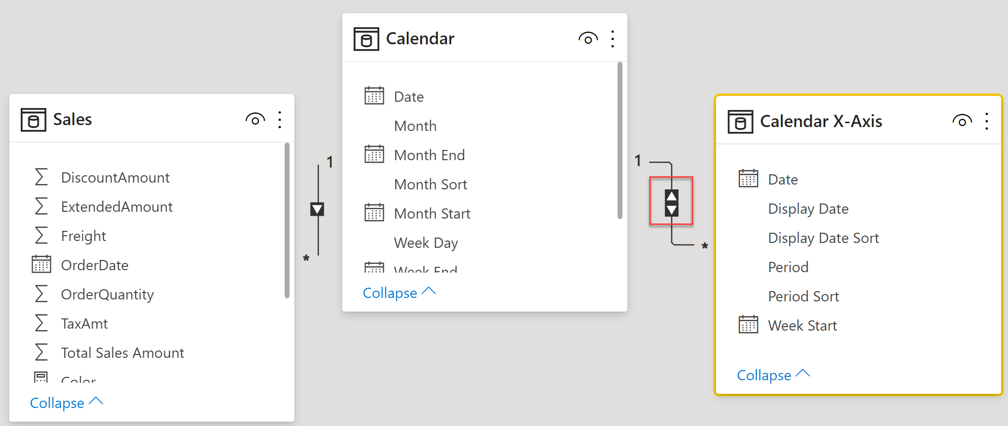
All this was made possible by adding a calculated table called Calendar X-Axis (columns from this new table will be used on the x-axis), and particularly the Display Date column in this table is important. Once this table is ready, we just need a few simple measures that will take care of everything. Below is the DAX for the calculated table whose columns we will be using on the x-axis.
Calendar X-Axis =
//get required column from existing Calendar dimension in our model
VAR __date = SELECTCOLUMNS ( 'Calendar', "Date", 'Calendar'[Date], "Week Start", 'Calendar'[Week Start] )
//create a table for dates
VAR __TableWithDates =
    ADDCOLUMNS (
        __date,
        "Display Date", FORMAT ( [Date], "MM/dd/YYYY" ),
        "Display Date Sort", FORMAT ( [Date], "YYYYMMDD" ),
        "Period", "Date",
        "Period Sort", 1
    )
//create a table for weeks
VAR __TablewithWeek =
ADDCOLUMNS (
    FILTER ( __date, WEEKDAY ( [Date] ) = 1 ),
    "Display Date", "Week " & FORMAT ( [Date], "WW, YYYY" ) ,
    "Display Date Sort", FORMAT ( [Week Start], "YYYYMM" ) & FORMAT ( DAY ( [Date] ) - 1, "00" ),
    "Period", "Week",
    "Period Sort", 2
)
//create a table for months
VAR __TablewithMonth =
ADDCOLUMNS (
    FILTER ( __date, DAY ( [Date] ) = 1 ),
    "Display Date", FORMAT ( [Date], "MMM, YYYY" ),
    "Display Date Sort", FORMAT ( [Date], "YYYYMM00" ),
    "Period", "Month",
    "Period Sort", 3
)
//combine all 3 tables dates/weeks/months
VAR __FinalDateTable =
UNION (
    __TableWithDates,
    __TablewithWeek,
    __TablewithMonth
)
RETURN
__FinalDateTable
The above DAX code for the calculated table contains the following columns:
| Date | A date column for each granularity. For the dates, we will have all the dates from the Calendar table. For weeks, we will have the first date of each week and for months, we will have the first date of each month. |
| Display Date | The text we show on the x-axis for each granularity. |
| Display Date Sort | Used to sort the Display Date column to show the values in the correct order on the x-axis. This is a critical column and it helps to make sure that the month shows up before the week and the week shows up before the date. If we need to change the order from Month -> Week -> Date on the x-axis to Date -> Week -> Month then we would make that change in this column. In this example, I’m showing the month first, then the week and then the date. |
| Period | This is the label for the granularity, while will be used on the slicer. In this case, we have “Month, Weeks, Dates.” |
| Period Sort | Used to sort the Period column to show the correct order of the Period in the slicer. |
The following table describes the values for each column in the calculated table.
| Granularity | Display Date | Display Date Sort | Period | Period Sort |
|---|---|---|---|---|
| Date | Gets each date from the Calendar table. | Sorting the Display Date column, formatted as YYYYMMDD. | Date | 1 |
| Week | Gets the first date of every week. I’m using Sunday as the first day of the week and displaying the week number of the year and the year on the x-axis. | Here we sort the week by YYYYMM and subtract one day from the week’s start date. | Week | 2 |
| Month | Gets the first date of the month for each month from the Calendar table. | Sorting by YYYYMM and 00 for 1st. For example, January 2021 will be 20210100 | Month | 3 |
Once our calculated table is ready, we just need to add few measures. Before that, we will make a relationship between this new calculated table and the Calendar table on the Date column. Of course, it will be a “one to many” relationship and the cross filter direction is set to both, meaning that the Calendar X-Axis table will filter the Calendar table. If we want, we can have the cross filter direction set to single and then use the CROSSFILTER DAX function in the measure to set the direction to both.
Here is the base measure and the logic is pretty straightforward. We check the current context of the Period column in our visual, and if the current context is a week, we will get the week’s start and end date. If the current context for the Period column is a month, then we get the start and end date of the month. From this date range, we filter the Calendar table. Once we have the start and end range, we just filter the Calendar table using the DATESBETWEEN DAX function, and wealso pass the “none” value to the CROSSFILTER function. We are making sure that no cross filtering occurs between the relationship; in other words, we don’t want the Calendar X-Axis table to filter the Calendar table.
In case the current context for the Period column is the date, we don’t need to do anything in the measure. Calendar and Calendar X-Axis both have rows for each date and Calendar X-Axis will filter the Calendar table and we will get the correct sales for each date.
Sales Combined =
VAR __period = MAX ( 'Calendar X-Axis'[Period] )
RETURN
IF (
__period IN { "Month", "Week" } ,
VAR __startDate = IF ( __period = "Month", MAX ( 'Calendar'[Month Start] ), MAX ( 'Calendar'[Week Start] ) )
VAR __endDate = IF ( __period = "Month", MAX ( 'Calendar'[Month End] ), MAX ( 'Calendar'[Week End] ) )
RETURN
CALCULATE (
[Sales],
CROSSFILTER ( 'Calendar'[Date], 'Calendar X-Axis'[Date], None ),
DATESBETWEEN ( 'Calendar'[Date], __startDate, __endDate )
),
[Sales]
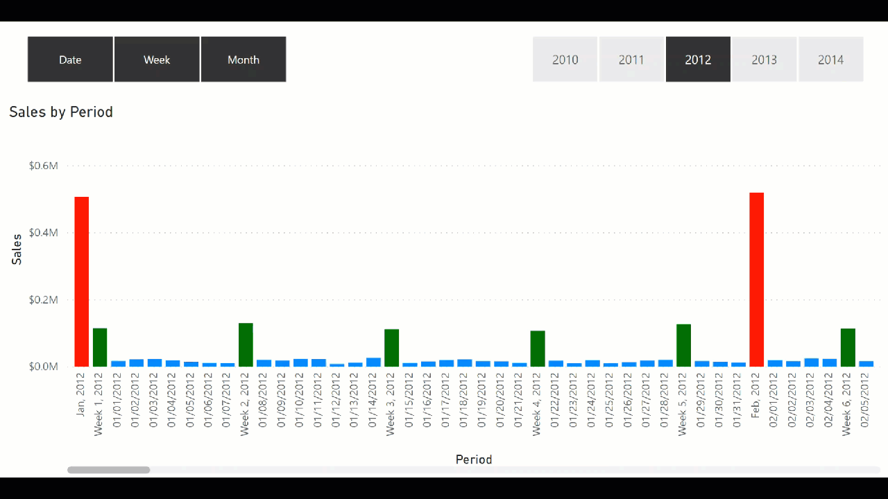
)Once the above measure is added, I simply added a bar chart. On the x-axis, I added Display Date from the Calendar X-Axis table and the above measure. I also added a slicer and used the Period column in the slicer. This is the output:
In case I want to show the sales by date as a line chart but want to continue showing the sales by week and month as a bar chart, I also extended the functionality. To achieve this I added two measures. One is called “Sales Combined – Date Only” and in this measure, if the current context for the Period column is week or month it will return BLANK() value, otherwise it will simply return the “Sum of Sales” measure.
Sales Combined - Date Only =
IF (
    MAX ( 'Calendar X-Axis'[Period] ) IN { "Week", "Month" },
    BLANK(),
    [Sales]
)
And the second measure I have added shows bars for the sales by week and month. I called this measure “Sales Combine –Date Off” and in this measure, if the current context for the Period column is a date then it will return BLANK() value, otherwise it will simply return the value from the “Sales Combined” measure that we created previously.
Sales Combined - Date Off =
IF (
    MAX ( 'Calendar X-Axis'[Period] ) IN  { "Week", "Month" },
        [Sales Combined]
)
To visualize all this I used the Line and Clustered Column visual and on the Shared axis I used Display Date. On the Column value I used “Sales Combine – Date Off” and on the Line value I used “Sales Combined – Date Only.” The output is what we saw in the first image in this blog post. The bars shows the sales by week and month and the sales for each date are shown on the line chart.
That’s it for now! I think it is easy to add different levels of granularities in the same visual without using the drill up and down functionality in order to see everything at the same time. Until the next blog post, enjoy!


No comment yet, add your voice below!